|
 Today was my first day of painting, as opposed to planning where to paint by putting marks on the canvas. I started off with two pure colours, which is very rare. I tend to have a selection for mixing, and I work with six primary colours, white, and a black or near-black. However, today I wanted to go very dark, and have no hint of other parts of the spectrum. The background had to retreat, and be dim and indistinct. I wanted to blend colours that were not very far from each other. Today was my first day of painting, as opposed to planning where to paint by putting marks on the canvas. I started off with two pure colours, which is very rare. I tend to have a selection for mixing, and I work with six primary colours, white, and a black or near-black. However, today I wanted to go very dark, and have no hint of other parts of the spectrum. The background had to retreat, and be dim and indistinct. I wanted to blend colours that were not very far from each other.
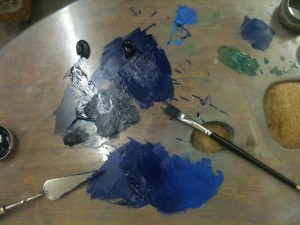
The area with the paintbrush pointing at it is a blob of Ivory Black (no longer made with ivory) and a little clockwise of it is Ultramarine (not made with real lapis lazuli). The mix that joins the two is 1:3 in ratio, approximately. It is dark enough that someone in the studio mistook the mix for black, despite it being only a quarter black paint by volume. This may be a different pigment ratio, depending on the mix. If there is more oil in one for the same consistency, that alters how they mix. I have very strong colours, and I like using them.
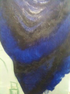
 Normally I would consider it lazy to use pure colours, but I did apply the ultramarine directly to the canvas as the mid tone. I applied it very thinly, with a glaze or by scrubbing the brush. This has the annoying effect of altering how light falls on the surface, as some is oily, but as I am planning to treat the surface with a glaze or a unifying varnish, it is not a problem unless I paint over something that is not yet dry. The thinner blue can be seen here, and it clearly needs something else. Up at the top there is a lot of reflection from the strip lights above. I was at one point standing on the base of the easel to get the right viwing angle to avoid glare, and to make sure my shadow was cast on the paint. I cannot use the strip lights for detail painting with any hope of getting accurate colours, but for filling in areas where I have a pre-mixed set of paints, they are a good way of saving my eyesight. Normally I would consider it lazy to use pure colours, but I did apply the ultramarine directly to the canvas as the mid tone. I applied it very thinly, with a glaze or by scrubbing the brush. This has the annoying effect of altering how light falls on the surface, as some is oily, but as I am planning to treat the surface with a glaze or a unifying varnish, it is not a problem unless I paint over something that is not yet dry. The thinner blue can be seen here, and it clearly needs something else. Up at the top there is a lot of reflection from the strip lights above. I was at one point standing on the base of the easel to get the right viwing angle to avoid glare, and to make sure my shadow was cast on the paint. I cannot use the strip lights for detail painting with any hope of getting accurate colours, but for filling in areas where I have a pre-mixed set of paints, they are a good way of saving my eyesight.
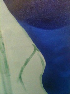
Down to the bottom right there is a big gap where I had a decision to make. Did I want the fall of cloth and glass to be standing alone or connected to the background? If I wanted it connected then it had to be here, at the end of the outline that people’s eyes might follow. I had given them plenty of chances to look at other things, and here I decided to up the illumination and give the painting at least a hint of middle ground. Lightening the colour here meant I had to bring in a new pigment.
 Cerulean blue is a cold, cold colour, but mixed with black and ultramarine, and surrounded by them, it would look purple. With the darkness behind it gives an effect of translucence to the air that I really want to carry off in the foreground as well. A high level of blending blurred it enough that it would stay in the distance, while the fact that light was falling on it meant it is obviously also coming forward. The brain cannot help but put it in the middle distance, in a scooped-out shape. This is drawing in paint. The colour is incidental to the design. Cerulean blue is a cold, cold colour, but mixed with black and ultramarine, and surrounded by them, it would look purple. With the darkness behind it gives an effect of translucence to the air that I really want to carry off in the foreground as well. A high level of blending blurred it enough that it would stay in the distance, while the fact that light was falling on it meant it is obviously also coming forward. The brain cannot help but put it in the middle distance, in a scooped-out shape. This is drawing in paint. The colour is incidental to the design.
The addition of a lighter blue eased the problem of the thin glaze seeming flat. I was able to blend in the colour on all of the high points of the canvas behind in colour that was now sympathetic to those that I had laid down. By limiting my palette to three colours I made sure that every part of it would go with every other part of it.
After I had set up the background, I knew I had an interesting shape. It is mainly triangular, but not so obviously as to be boring. The only potential problem is that the shadows on the right may blend into the darkness behind. I cannot lighten the cloth in the background without bringing it forward.
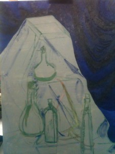
 The last thing I did was sketch in the dark areas and shadows, as well as the major points of the painting, to give me an easier start the next day, and to give me a chance to look at it afresh and check the design. The slight left lean of everything here is because the canvas itself is at an angle. The squarish top makes me want to put some sort of label or plaque there, but I believe I will have to resist that temptation. Unless I could find a good design it would detract from the overall look. The last thing I did was sketch in the dark areas and shadows, as well as the major points of the painting, to give me an easier start the next day, and to give me a chance to look at it afresh and check the design. The slight left lean of everything here is because the canvas itself is at an angle. The squarish top makes me want to put some sort of label or plaque there, but I believe I will have to resist that temptation. Unless I could find a good design it would detract from the overall look.
The top does look like it could be a double layer, but I will have to approach it very carefully. If I get it wrong then it will look like I have failed to paint something flat, instead of successfully painting something at an angle. As it is, I have to manage to paint a soft cloth over a hard support, in a way that does not make the support look twisted. I may, shock horror, have to lie. I suppose I could say ‘make things up from whole cloth’…
|