|
|
 My first stage in planning a painting is staring at a rectangle for a while. Usually, this is in a sketch book, and then I cover it with marks. What I am doing is working out where bits of the painting will go. Once I am finished, the painting will be viewed by other people, and it has to pass three tests; does it look good at thirty feet, does it look good at six feet, and does it look good at six inches away. Mostly the public will be pulled in by something they see across the room, and then will go closer to look at it. People who have been taught how to look at art will then peer at it far more closely. I do that last one a lot, when I am trying to work out how a particular effect happens. It’s the test of a fine artist sniffing out other fine artists and going ‘yeah, I could do that*,’ and I have also seen people thinking of buying a work doing the same thing. My first stage in planning a painting is staring at a rectangle for a while. Usually, this is in a sketch book, and then I cover it with marks. What I am doing is working out where bits of the painting will go. Once I am finished, the painting will be viewed by other people, and it has to pass three tests; does it look good at thirty feet, does it look good at six feet, and does it look good at six inches away. Mostly the public will be pulled in by something they see across the room, and then will go closer to look at it. People who have been taught how to look at art will then peer at it far more closely. I do that last one a lot, when I am trying to work out how a particular effect happens. It’s the test of a fine artist sniffing out other fine artists and going ‘yeah, I could do that*,’ and I have also seen people thinking of buying a work doing the same thing.
* with several years of practice
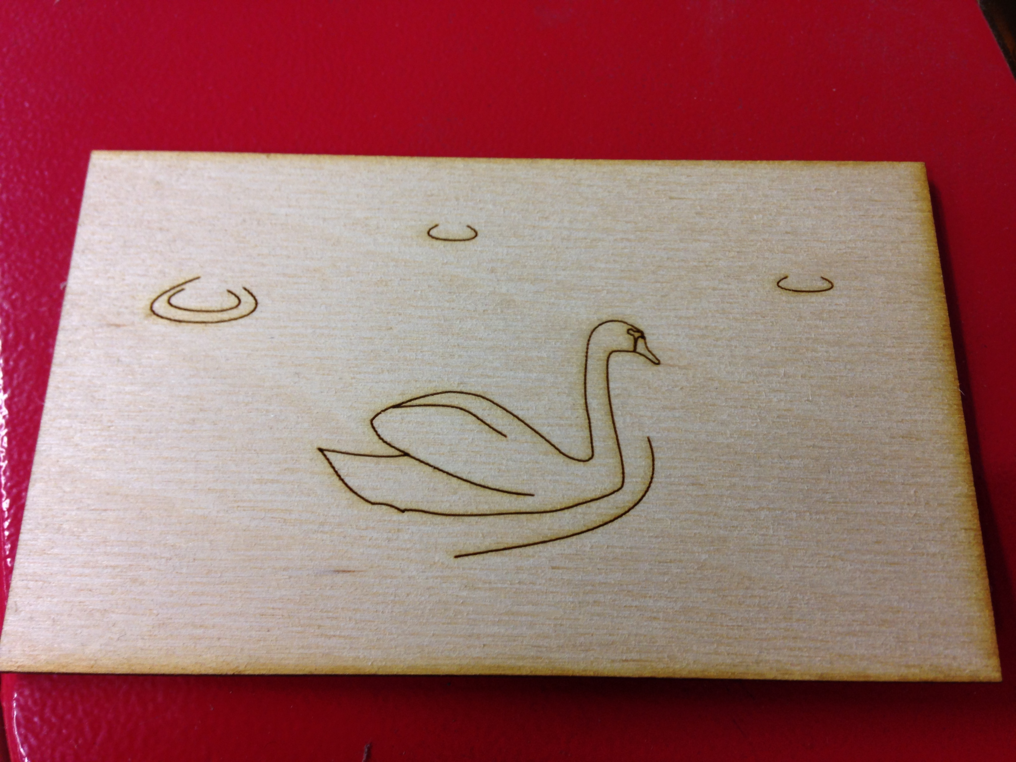
I subscribe to the theory that there are two sorts of subject, ‘mountain’ subjects that stand alone, and ‘valley’ subjects that lead the eye in from the edges. It is easy to draw a mountain in isolation, and almost impossible to draw a valley without the accompanying land. Here, I am talking about mountain subjects. A Still Life generally sits inside a painting, as a pile of selected things, and a formal portrait is usually presented against a neutral background. In all mountain subjects, it is important not to crowd the viewer’s eye. The easiest way to do this is not to let the picture approach the edges of the painting. The swan picture here has plenty of blank space. I designed it as a tester to show a client a particular effect on a laser cut painting. The extra space around the outside gives the brain a rest. Because the swan is in the middle of the picture, it looks like it is hurrying, because there is an equal spacing of wood to the left and the right, but we know that the swan is moving. It’s halfway through a journey, and partway through the illustrated story of that journey. If you put the swan over to the left, it would be beginning that journey, and if you put it over to the right it would be ending it, and it would look cramped. We have a concept of Looking Room; the subject of a painting needs room for their gaze.
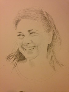 Even the simple placement of a portrait on a webpage is a planned point. When posting pictures of things or people with eyes, I try to have them looking towards text. If they are looking away from the page, it is distracting. The lady in this portrait has about a quarter of the paper just to look at. If her gaze was out towards us, we would be able to zoom in closer on her if we wanted to, but brains are set up for facial recognition, and we know that she is a person and people do not look at the edges of walls and the frames they are in. If she is too close to the side of her picture, it will look cramped, possibly without the viewer even knowing why. That space is the looking room. In a valley picture, there is seldom looking room because the subject tends to be something other than a human or an animal. A quick google of classical paintings should show you just how many have room to the sides where the subjects are looking. This Link also showed me an amusing number of celebrities being given the classical portrait treatment. Your luck may vary. Even the simple placement of a portrait on a webpage is a planned point. When posting pictures of things or people with eyes, I try to have them looking towards text. If they are looking away from the page, it is distracting. The lady in this portrait has about a quarter of the paper just to look at. If her gaze was out towards us, we would be able to zoom in closer on her if we wanted to, but brains are set up for facial recognition, and we know that she is a person and people do not look at the edges of walls and the frames they are in. If she is too close to the side of her picture, it will look cramped, possibly without the viewer even knowing why. That space is the looking room. In a valley picture, there is seldom looking room because the subject tends to be something other than a human or an animal. A quick google of classical paintings should show you just how many have room to the sides where the subjects are looking. This Link also showed me an amusing number of celebrities being given the classical portrait treatment. Your luck may vary.
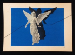 It is of course possible to play with the rules. This angel by the very talented Opie Art on Facebook is an example of using the edges. There is still peaceful room on either side of the single figure, but the shadow and the chains pin it in space. Having them extend over the edge of the background blue makes it much more effective. Here there is plenty of room for the figure, but its foot nearly touches the white at the bottom. Is it flying above that surface, or does the surface not actually exist? The shadow above gives a little hint, but the edges are used to add mystery, not just to be around the outside of the picture. It’s really well designed. It is of course possible to play with the rules. This angel by the very talented Opie Art on Facebook is an example of using the edges. There is still peaceful room on either side of the single figure, but the shadow and the chains pin it in space. Having them extend over the edge of the background blue makes it much more effective. Here there is plenty of room for the figure, but its foot nearly touches the white at the bottom. Is it flying above that surface, or does the surface not actually exist? The shadow above gives a little hint, but the edges are used to add mystery, not just to be around the outside of the picture. It’s really well designed.
|