|
The day’s painting was frustrating, because I could not exactly match the colours I had mixed last time I worked on this piece. Part of that reason was that I was painting thicker. A thick skin of paint gives a different effect to a thin skin of paint and I was lost in albedo, reflection, refraction, transparency, and tweeting about being a talentless hack. (If you want to look me up, I am @dianaprobst, and I talk semi-regularly there).
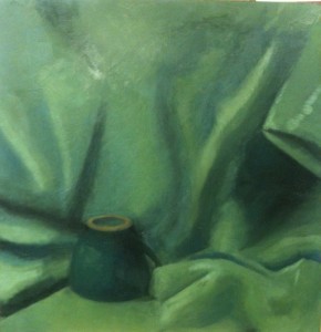
 This shows some rather harsh folds over to the left, but the green colour is getting deeper, and I like that. It will take a couple of relatively thin glazes over this, and then I will decide if it is workable or if I go over the whole thing in far paler colours and then add darker green above, going back to something like my old style. If I can keep up this newer method, then I will be cutting down considerably on the time spent on such a painting. That will make it more accessible, and means I can make more, launching a wider line of prints. If I cannot, then I keep going with the slow method that I already know produces results in the end. This shows some rather harsh folds over to the left, but the green colour is getting deeper, and I like that. It will take a couple of relatively thin glazes over this, and then I will decide if it is workable or if I go over the whole thing in far paler colours and then add darker green above, going back to something like my old style. If I can keep up this newer method, then I will be cutting down considerably on the time spent on such a painting. That will make it more accessible, and means I can make more, launching a wider line of prints. If I cannot, then I keep going with the slow method that I already know produces results in the end.
I like the bottom right corner, and most of the right side. The cup is annoying me a little but I knew that was not finished anyhow, so when I get on to it, I’ll free it from the background and highlight it properly, and then it will sit out solidly and keep the rest of the picture anchored.
|