|
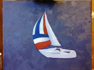
 This commission started, as they often do, with sketches and squinting at the canvas. I painted a purple background, made of the blue and red I used for the sail with titanium white, which is a workhorse white; it’s nothing special, but it gets the job done, and it’s good for the lower layers. I prefer lead white for texture, but in this case I wanted spreadability, so I am staying with the same white at all levels. This commission started, as they often do, with sketches and squinting at the canvas. I painted a purple background, made of the blue and red I used for the sail with titanium white, which is a workhorse white; it’s nothing special, but it gets the job done, and it’s good for the lower layers. I prefer lead white for texture, but in this case I wanted spreadability, so I am staying with the same white at all levels.
After sketching I positioned the boat on the canvas and blocked in the colours. The sail is nicely shaped, but is probably going to have to change as the rest of the painting gets filled in. It fits well with itself but I would hesitated before matching it to a sky.
I have a bit of a data problem, in that the photographs I have to work from are not at the angle I want. That means painting the boat in several layers, so I can adjust each to be more accurate than the last, rather than struggling to calculate tone, hue, and position all at once. Knowing what goes where will help me to make it the right colour. I’m estimating five days for this, which is the cap I’ve given to my client for costs. Here’s hoping.
|