|
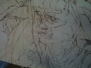
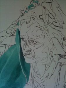
Day six was a short day, spent mostly in tracing things, after a morning spent zombieing around Cambridge wondering why the stars were so bright and there was only one of them. Anthony, my tutor, had asked how I would stop myself from losing the precision of the under-painting, and had suggested an answer – an acetate tracing. So armed with a giant-sized sheet of acetate, a permanent marker, and a lot of masking tape, bravely I stepped forth to battle my foe.
By now I knew the shape of the painting, so there was little to surprise me. Photo herewith:
 My soundtrack for the battle was mostly by Suede and Pulp. Britpop is very good for tasks where I need to lose myself without being too upbeat and bouncy. This called for slow attention, but did not use all of my brain, so I sang along with W.S.D. and Disco 2000. Bite me! I also invented the genre of Pritpop, which is Britpop for Welsh people. It is even more downbeat and depressing than its parent genre. My soundtrack for the battle was mostly by Suede and Pulp. Britpop is very good for tasks where I need to lose myself without being too upbeat and bouncy. This called for slow attention, but did not use all of my brain, so I sang along with W.S.D. and Disco 2000. Bite me! I also invented the genre of Pritpop, which is Britpop for Welsh people. It is even more downbeat and depressing than its parent genre.
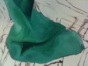
The next day, I was ready to start. After about an hour of panicking in a muted way and hanging around in entirely the wrong room hoping for a miracle, I set to work. I mixed cerulean blue (what you would think of as the primary Colour Blue) with Viridian (the colour of a dark ivy leaf) and added titanium white to some of the mix, then took some of /that/ mix and added more white to it. This gave me most of the range of greens in this picture:
 Some of the highlights here have even more white in, some of the low tones have a bit of ultramarine instead of the cerulean blue. As you can see, even without details the cloth is beginning to look more real than the surrounding painting. My hope is that I can complete the whole thing in that style; things get more and more real, without any major trauma. It is not a deeply-held hope. Some of the highlights here have even more white in, some of the low tones have a bit of ultramarine instead of the cerulean blue. As you can see, even without details the cloth is beginning to look more real than the surrounding painting. My hope is that I can complete the whole thing in that style; things get more and more real, without any major trauma. It is not a deeply-held hope.
At the top of that thumbnail you can see how I am working; I add patches of the correct tone in the correct place, and eventually they all join up. At some point I have to start adding details. This is the same as the general tones, but on a smaller scale – unless there are actual tattoos, people do not have lines on their skin. They have folds, which are steep gradients of tone.
There are also folds in the towel, most obvious on the other side:
 This is just how lips or eyelids work, but very much larger. The darker colours recede and recede until they start getting brighter again. Details get lost within the recesses because there is less light there. As a painter’s trick, I will be leaving out some of the detail I can see, so that the area will seem further away. A good photograph is not necessarily a good painting, and for this painting I want to bring forward the forward areas, to make it look three-dimensional. This is just how lips or eyelids work, but very much larger. The darker colours recede and recede until they start getting brighter again. Details get lost within the recesses because there is less light there. As a painter’s trick, I will be leaving out some of the detail I can see, so that the area will seem further away. A good photograph is not necessarily a good painting, and for this painting I want to bring forward the forward areas, to make it look three-dimensional.
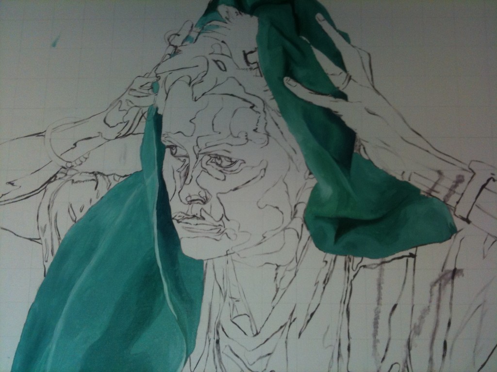
The right side had more cast shadows, was more desaturated (add contrasting colours and/or grey) and had a darker overall look. I used twice as many colours on the right as on the left for my basic mixes. Some of that was because I was more confident in the afternoon, some of it was because the colours were deeper on that side. I will probably alter the left side slightly to compete with the richness of tones, but that decision can wait until I have more colour on the canvas.
So. The day’s finished product:
|