|
|
Or, what I bought on my holidays
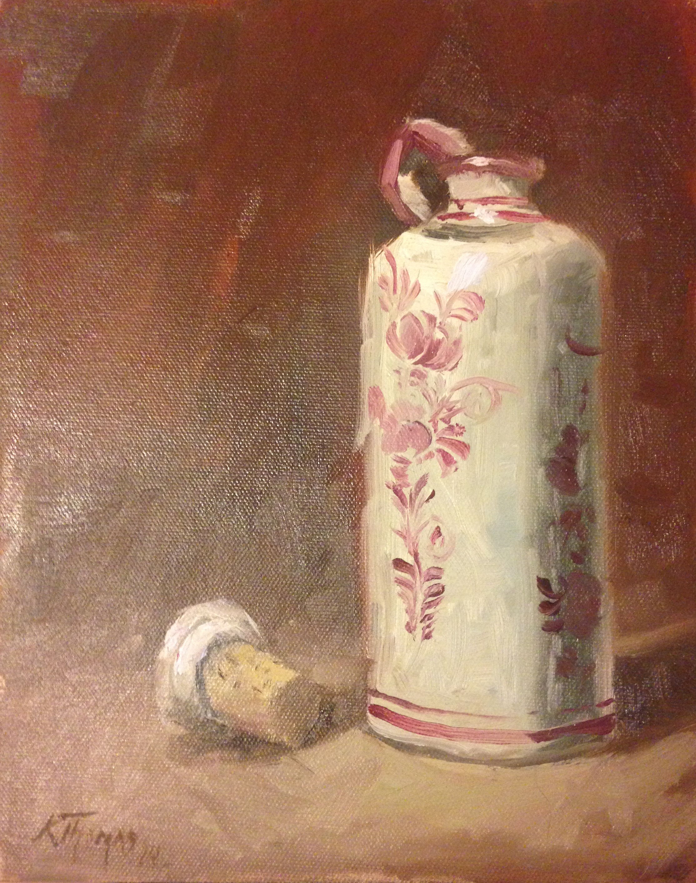
 At Christmas, I bought myself an art work by Kyle Thomas, an American artist. He has a loose style of painting, and I wanted to see this one up close. I felt I could learn a lot from it, and I also wanted to own it. At the price it was, I could not resist, and now I’m holding it and trying to work out what the artist did. This page is my brain-blurt of the things I want to take away. It is tagged under critique, but my idea here is not to look at what could have been done, but how it was done, by someone who was actually present. At Christmas, I bought myself an art work by Kyle Thomas, an American artist. He has a loose style of painting, and I wanted to see this one up close. I felt I could learn a lot from it, and I also wanted to own it. At the price it was, I could not resist, and now I’m holding it and trying to work out what the artist did. This page is my brain-blurt of the things I want to take away. It is tagged under critique, but my idea here is not to look at what could have been done, but how it was done, by someone who was actually present.
It is on a good quality canvas board, but not one I have seen before. I think it has a little less tooth than the canvases I normally use. The threads are thinner, meaning that the surface is flatter to paint on. He is using thinner paint than I would, and a variety of brushes. In the background, there is a stroke about an inch wide, but it is rounded at the ends, so was probably splayed out a bit. It’s not a flat. He is giving up control for speed and the effect of painting fast.
In terms of the order he did things, I’m guessing he put in most of the bottle form first onto a colour-primed canvas, then the background, and the bottle details. The background and bottle were at least two layers – blocking out and then painting, as I would think of it. The cork probably went on with the bottle – it has the same colours in it. The bottle was probably a flat shape, and then had the form added. The way the shadow wraps around then then becomes flat to the right is a relic of how many colours were available.
It’s a very compressed palette. The red looks like one of my Mir colours, which is not quite alizarin crimson, but has a bit of blue in it. The brown looks like burned sienna, which is a colour everyone has. Add in a bit of blue to get the darker grey, mix it all up, and add white where needed. There are touches of what looks like a genuine dark grey or dark brown in the cork and the background. There might just be some ochre in the cork, but I’m not betting on it. You could paint this in four colours, including white, if you were prepared to. That’s what makes it a really tight picture – every colour in it does a job. The loose, easy brush strokes are kept together by the limited palette.
There is a sheen in the background that says Mr Thomas thinned down the paints with oil, or had an oily brown that flowed easily. There’s a patch of paler brown where the underpaint shows through, as if shadows have been added afterwards with blackened, desaturated sienna. The painted flowers also have a sheen, but the bottle itself doesn’t. (As an artist, I’ll probably even all that up in varnishing or by oiling it really carefully.) I’m assuming titanium white, which is by far the most popular, and very opaque. That fits with how the colour of the surface moves into the colour of the background. There is no definite edge of a table – that would have been an extra difficulty in a fast painting. Instead there is a front part and a back part, and a mystery in between. That makes the solid bottle and cork stand out as solid objects, by comparison. The painting concentrates on nothing else but them, and they are the only revealed parts.
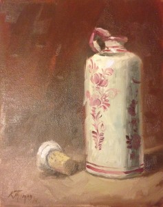
There is one part that I don’t like, and that’s the breaking of the left vertical. There is a bit of twisting of the right vertical, which adds to the shadow/reflection effect there, but the left hand side has that visible step. It’s a trade-off between looseness and precision, and there, the stroke stopped an inch short. It is not a massive problem, but it’s a little jarring. If a single stroke in a painting isn’t perfect, I can’t complain. For the purposes of this examination, it’s really helpful, because the patch of brown where the stroke isn’t turns out to be the same colour as the paler patch of background, showing a bit more of the order of painting. The darker background goes up to the outer edge of the shortened stroke.
So that’s what I’ve learned from Kyle Thomas’s Delft Bottle. If you want to own what I think of as a sister piece, Sake Bottle and Cup is available, and so is Two Sake Cups. If you are in America, or don’t mind paying shipping abroad, I recommend those two, as well as a general browse of his site.
~~~
Kyle Thomas is on Twitter
His website: http://kylevthomas.com/
Thanks to Kyle for letting me examine one of his works so closely in public.
|