|
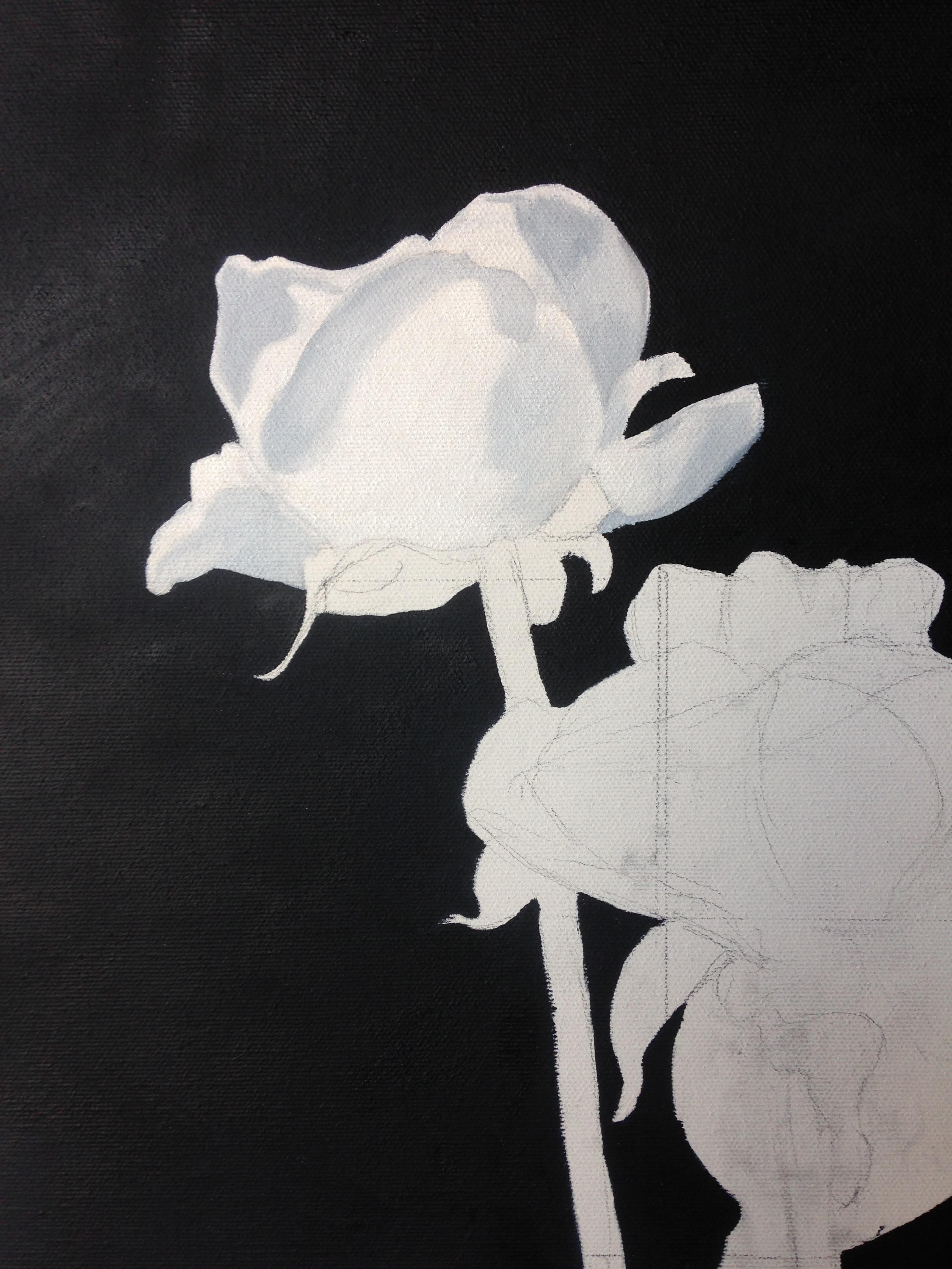
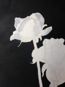 I spent the next day of painting starting to block in the colours. Most of this will not be visible, but it deepens the paint colours for the top layer, and lets me experiment. The first colour, and the most obvious one, was grey. The white rose was a mixture of titanium white and the same background grey as I had already used. Paynes Grey tends to blue when it is lightened, so it is not merely a dull colour. After that I used the same grey, but darker, to fill in and shape the coffee pot. This is a reflective silver and would be good practice for the brassy reflections of the pot on the left. After that, I went back to the pink and the red roses. I was trying not to shape them too much, as that is the job of the next layer of paint. I spent the next day of painting starting to block in the colours. Most of this will not be visible, but it deepens the paint colours for the top layer, and lets me experiment. The first colour, and the most obvious one, was grey. The white rose was a mixture of titanium white and the same background grey as I had already used. Paynes Grey tends to blue when it is lightened, so it is not merely a dull colour. After that I used the same grey, but darker, to fill in and shape the coffee pot. This is a reflective silver and would be good practice for the brassy reflections of the pot on the left. After that, I went back to the pink and the red roses. I was trying not to shape them too much, as that is the job of the next layer of paint.
In each case, I was attempting to define where the next bit of paint would go, and to push out to the edges of the darkness at the back, sharpening up the lines. In a couple of places I had to mark out where the petals would sit out over the leaves. I had already created extra space by pulling out leaves and now I had to deal with that. Finally, I used the red and grey to make the reflection of the cloth in the coffee pot.
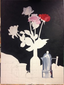 The bright red of the rose is possibly a mistake. It competes too hard with the pink, but the black surrounds it well. The coffee pot is also strongly coloured, but further down the canvas. I will have to wait until I am finished with the first underpainting to find out how it really looks, and what to do next. The bright red of the rose is possibly a mistake. It competes too hard with the pink, but the black surrounds it well. The coffee pot is also strongly coloured, but further down the canvas. I will have to wait until I am finished with the first underpainting to find out how it really looks, and what to do next.
Oil painting is really slow. I spent about six hours at the easel today, stopping only when the light failed. The pink haze on the white parts here is the effect of sodium light. The iPhone camera is not always up to paintings, especially when they have one colour that overpowers the rest. Human eyes are much better at accounting for local and large changes.
|