|
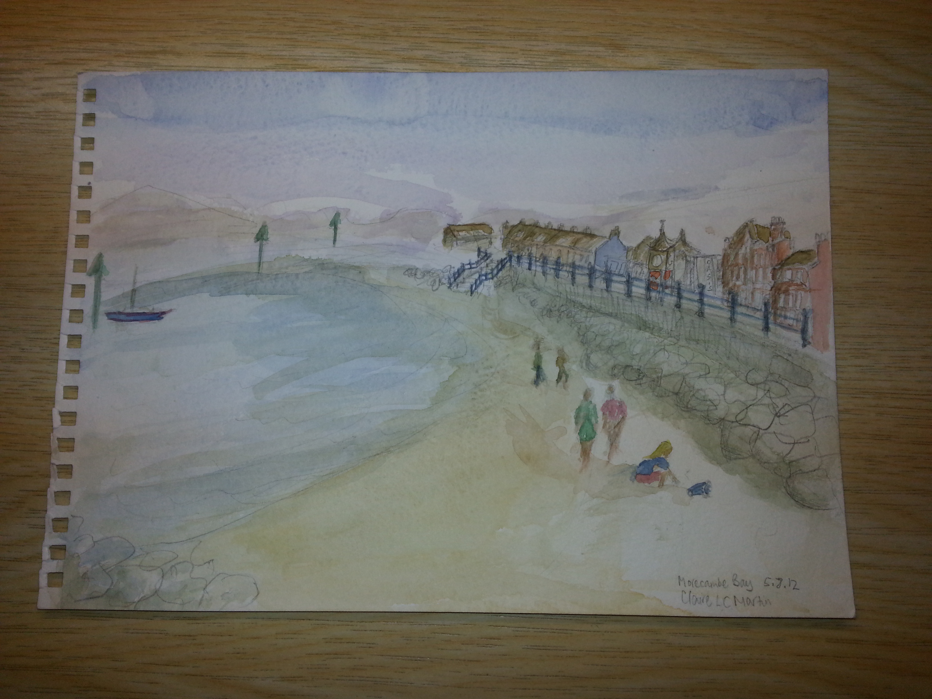
 Welcome back to critique of paintings that are not mine; this is a watercolour of Morecambe Bay. First off, the good bits; the people are great. I have a lot of trouble drawing people quickly in watercolour and the artist has nailed it here. The distant blending of sea and sand is a good fade out. The nearby buildings are good. Welcome back to critique of paintings that are not mine; this is a watercolour of Morecambe Bay. First off, the good bits; the people are great. I have a lot of trouble drawing people quickly in watercolour and the artist has nailed it here. The distant blending of sea and sand is a good fade out. The nearby buildings are good.
What needs improvement? I left this one until now because it combines some of the problems of the pencil and the watercolour I have looked at before. The perspective breaks down when the artist does not have the confidence to make things small. Solutions to this are smaller, sharper tools, looseness in painting meaning the edges blur, tightness in painting meaning that the houses stay small, looseness in drawing resulting in fewer lines and less trying to cramp things in… There are lots of potential solutions. I would try repainting this, with one rule: do not paint any detail that is smaller than the body of the nearest person. The people are the most interesting, important thing here. The windows on distant houses should not be competing. Simplify the other, distant shapes. Everything past the clock tower can start to blur and fade a little. No matter whether you can see the individual struts of the fencing from your viewpoint, you do not have to draw them fully. A vertical flick ot two would probably suffice.
The hedges would be best treated as a pale greenish band, with the shadows added later in darker green. Hedges are /horrid/. Don’t worry if they end up looking bulgy or solid. When I am Art Director for the World, hedges will be banned. Other than this, there is one more thing to think about. The white space here looks like it was left in by accident. Try a gentle sky wash just like in the picture, but then graduating to yellow, all the way down the page. Out on location that takes a long time to dry, but in the studio it will pull things together. After that, you can paint a bluish sea and it will probably end up like the green that is here. I would really like to look at this, repainted with that in mind.
|