|
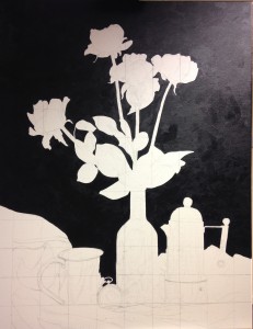
 Day two of painting was mostly simple. I played around a little with backgrounds, and then decided to go for a plain, dark colour. What looks like black is in fact Payne’s Grey, a very dark but warm colour which lies solidly on the canvas. It only looks anything but black when it is next to black, but optics are optics, and this will give an illusion of depth without being the darkest possible colour. I might go over it one more time with a hint of blue as a nod to the background on the photo, but I felt it was better to simplify behind so as to concentrate on what was in front. Day two of painting was mostly simple. I played around a little with backgrounds, and then decided to go for a plain, dark colour. What looks like black is in fact Payne’s Grey, a very dark but warm colour which lies solidly on the canvas. It only looks anything but black when it is next to black, but optics are optics, and this will give an illusion of depth without being the darkest possible colour. I might go over it one more time with a hint of blue as a nod to the background on the photo, but I felt it was better to simplify behind so as to concentrate on what was in front.
I used the grey to define the edges of some of what I was going to paint later, in negative space. I made the shoulders of the bottle even and I shaped the ellipse on the jug. Then I cut into the jug, so that all the really dark reflections would be painted over the darkness of the background colour, demonstrating just how little light there was in the darkest corners. The jug is now asymmetrical on purpose, not by accident. I had to push the gamma up pretty high on my computer screen, making it lighter than I wanted, to be sure that the shadows were blending as I thought they were.
All in all, I painted a flat colour for well over five hours. After that it was too dark for colour matching, and I called it a day. I was not going to be able to start on the roses, as I had hoped, but I have a plan for them for day three.
|