Drawing Inspiration: Designing the Show
|
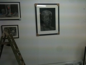
I have not got a single style. Right now I produce paintings in many different ways, and most members of the public, unprepared, assumed that the gallery was showing the work of several people. The best hint that it was not was the white space on the walls – it was definitely not like a commercial gallery, which has to show as many works as possible to as many people. I had planned the white space. I had a few things that I wanted to show off, and having them alone suited them well. In Britain, people coming into shops look to the left first. Many shop doorways are put up to reflect this. Whether ours was planned that way or not, it opens so people can look at the left wall. I put a screen in the right window, to hang things on it, and to keep the impact of what was on the right wall for after people had come in. This might have been a mistake, but I chose to do it that way for the Private View, and then I did not change it. To the left is a bay with the window making up one side of it. I hung a large print in the window, facing out. On the two walls I had left, I put my best charcoals, including the gigantic, imposing Pietro, a face and shoulders three feet high. He was the main draw on that side, but he was framed by the Mountains in the Moonlight and two still lives, and alone on the short edge of the bay was a simple, peaceful romantic scene of two close figures in uncertain light. That was the last charcoal, and it was put there not just to flatter the portait-orientation shape, but also so that to break away from it and look at the next thing would be a bigger decision, and the next thing would have more impact.The next thing was Woods with Millstone, a loose-painted colourful version of a Cezanne. It shared little in style with the charcoals, and was rather a surprise to people coming out of the bay. It had a lot of comment, and many people recognised the style; a few were definite enough to declare it was a version and not my own design. Going further around, there was Get You Yet, the pink candle with the surprising wick. It was the painting opposite the door, and it was bright enough to attract the eye from across the room. Its placing may or may not have had input into the fact it was sold. On the last wall, there was a tonal study in green and yellow, which has a green and gold frame, and although small looked very peaceful. It was one of my favourite things to look at during the day, when I had overloaded my brain by looking at my own pictures, or the pen and ink drawings I was doing got too much for me. Then beside that, there was the pencil sketch on canvas that was the original study for my self-portrait. I had some more supporting artwork on a table below. Taking up the biggest individual wall space and surrounded by blank space was my self-portrait itself, looking good in a gold frame. There was more there as well; the window display is its own matter, however. |
