|
Having had positive feedback for Blue on Blue, a tonal piece almost totally in one colour, and the impact of similar red and yellow pieces, I decided to continue in that vein, with a deep green, and another yellow more suited to the series. After online discussion with a friend that involved the word ‘ninja’ as a verb, I ‘borrowed’ a cup from the kitchen, and set up a simple still life. Then I stared at it for about twenty minutes, until I knew where all the darker parts were, and could start ignoring them in favour of where they should be. I have recently been greatly impressed with the blog and the work of Stapleton Kearns, an American landscape painter with an acute sense of humour and a huge love for talented traditional painting. He has already made an impact on my work, and one of the most interesting things he said was, ‘Design is intentional, not created from the cropping or found arrangement of nature.’
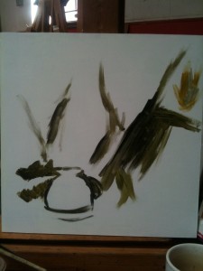
He said it in giant bold writing. The de-emphasis is mine. But with that in mind, I cannot help but paint differently, pre-planning more than I was doing. It meshes well with the advice from my tutor on the subject. What I started painting, after those twenty minutes, was this:
 There are a few things I put in on purpose here. I believe the big dark area to the right will balance the business of the cup, which is going to be a slightly different tone and texture to the cloth. The diagonal lines of folded cloth will pull the eye in towards the cup, but because it is to one side there will not be a problem with too much symmetry. The picture will not get dull. I could have put the cup on the right, but that would have had a diagonal sweep from top left to bottom right, which combined with the way that Westerners read, gives a slumping effect to the picture. We habitually go left to right, and thus the long straightish sweep would be going from top to bottom. Instead, it goes upward and will put some sort of paint candy there, as a reward for following it and a visual stopping point. The intersection where the large mass of shadows ends will have some sort of fold or highlight. There are a few things I put in on purpose here. I believe the big dark area to the right will balance the business of the cup, which is going to be a slightly different tone and texture to the cloth. The diagonal lines of folded cloth will pull the eye in towards the cup, but because it is to one side there will not be a problem with too much symmetry. The picture will not get dull. I could have put the cup on the right, but that would have had a diagonal sweep from top left to bottom right, which combined with the way that Westerners read, gives a slumping effect to the picture. We habitually go left to right, and thus the long straightish sweep would be going from top to bottom. Instead, it goes upward and will put some sort of paint candy there, as a reward for following it and a visual stopping point. The intersection where the large mass of shadows ends will have some sort of fold or highlight.
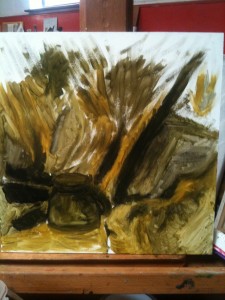
 After that, I filled in tone for a while. This underpainting let me understand in contrasting colours where my lights would fall, as well as my darks, and where there would be half tones, which is, depending on your definition, either the really narrow band of tonal values in the middle of a colour histogram of the painting, or everything that is not highlights or absolute darks. I am pretty sure that duels have been fought on that difference. The painting fora can get pretty hot about it. Either way, I wanted to look at the lighter part of the painting, now I had established a dark skeleton. Not that at this point the cup is not a pretty thing. It exists rather like a scribbled note, to tell me ‘cup goes here’. I have been known to write the names of things on my very rough draughts, instead of drawing them, and this is almost the same. The worked tone where some of the shadows will fall gives me a dark surface so that the lighter yellow behind can be seen more clearly for my internal critique, but it is only there to do a job, and tell me what the green version will be like. After that, I filled in tone for a while. This underpainting let me understand in contrasting colours where my lights would fall, as well as my darks, and where there would be half tones, which is, depending on your definition, either the really narrow band of tonal values in the middle of a colour histogram of the painting, or everything that is not highlights or absolute darks. I am pretty sure that duels have been fought on that difference. The painting fora can get pretty hot about it. Either way, I wanted to look at the lighter part of the painting, now I had established a dark skeleton. Not that at this point the cup is not a pretty thing. It exists rather like a scribbled note, to tell me ‘cup goes here’. I have been known to write the names of things on my very rough draughts, instead of drawing them, and this is almost the same. The worked tone where some of the shadows will fall gives me a dark surface so that the lighter yellow behind can be seen more clearly for my internal critique, but it is only there to do a job, and tell me what the green version will be like.
That was the end of my painting on this for the day, and I did other things as well, but this is the WiP.
|

