|
 Over the first week of July, I had a student in my tender care. We went through a lot of charcoal, as I moved her from line drawing towards tonal work. The good thing about tone is that it leaves a teacher with plenty of time to spare. So this is not a post about my student at all. It is a post about my painting. Over the first week of July, I had a student in my tender care. We went through a lot of charcoal, as I moved her from line drawing towards tonal work. The good thing about tone is that it leaves a teacher with plenty of time to spare. So this is not a post about my student at all. It is a post about my painting.
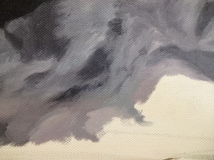
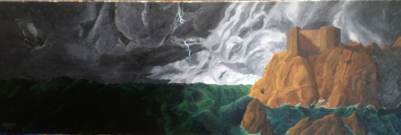
I had spent an afternoon sketching up a landscape based very loosely on Dubrovnik castle and the rock formation there. Most of the underpainting was in pencil, however, and consisted of colour notes and suggestions of flow. Over the course of two days I painted in a dark sky to the left with louring storm-ripped clouds, and then a paler grey where I wanted the lighter area of the canvas to be. My design notion was that there would be an area that was lighter with suggestions of a light source behind it. Where the lighter cloud was palest, I highlighted with Permanent Rose, and cooled down the shadows with cerulean. The darker cloud was cut with crimson and ultramarine, as well as cerulean, to blend with the paler greys.
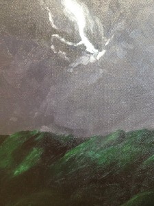
 Ignoring the lightning, which was removed from the final image, the sky was dark all the way across the left, and so was the sea. The waves were handled in much the same way as the clouds. Both are masses that have light and dark on them. Both have, like anything that is painted, a surface that reflects. The differences are matters of physics. In this case, I decided that green was a better colour than blue for the depth I would want, but as with the grey of the sky there were other colours hidden inside. I used both of my reds to dull the colour, depending on how bright I wanted the waves to be, and then added pure black to the really dim areas, along with my usual purple mix. The blackness had to creep up on the light in the cast of the waves, as they would be part of one mass, and not separate like the clouds would be. They could take a shadow from above, but they also had to lighten up more gradually as they approached the rocks. Ignoring the lightning, which was removed from the final image, the sky was dark all the way across the left, and so was the sea. The waves were handled in much the same way as the clouds. Both are masses that have light and dark on them. Both have, like anything that is painted, a surface that reflects. The differences are matters of physics. In this case, I decided that green was a better colour than blue for the depth I would want, but as with the grey of the sky there were other colours hidden inside. I used both of my reds to dull the colour, depending on how bright I wanted the waves to be, and then added pure black to the really dim areas, along with my usual purple mix. The blackness had to creep up on the light in the cast of the waves, as they would be part of one mass, and not separate like the clouds would be. They could take a shadow from above, but they also had to lighten up more gradually as they approached the rocks.
With the clouds, I had been able to bring in a rounded effect so that the edge of each mass brought the eye in towards the tip of the rock. I continued this with the horizon line being more even towards the land, and with a rolling wave that flowed over the foot of the rock so that the top of it provided highlights. Beyond the rolling wave there were more, darker rocks and broken sea, but nothing to keep the eye moving over to the right. Although there is visual interest in the area to the right, it is not reinforced by the design, but is there to provide a counterpoint to the long lines that are elsewhere.
The rocks themselves are in ochre, which as a reddish, warm rock was another reason to have the waves in green, as a more direct opposite. It took two days to paint each main area, with the castle and the last day of rock going on together. I will be pricing the piece at £500 unframed during the time my studio exhibition is on, in hopes of a quick sale.
Click through for a larger version:

|