|
 Over the past few weeks, I have been painting one particular canvas blue. It has appeared on this blog before, but the slow creeping of the paint over the surface was not particularly interesting. Days 5-14 were mostly ‘painted more blue’ with occasional ‘painted something yellow’ for light relief. However, it is getting closer to being a finished piece. Everything has at least one layer. Some things are at the final layer. People look at it and go ‘wow’ instead of asking, ‘so are you going to finish this one?’. I no longer have to explain what an underpainting is to visitors. (I do anyway. I’m like that. But I could get away without it if I wanted to.) Over the past few weeks, I have been painting one particular canvas blue. It has appeared on this blog before, but the slow creeping of the paint over the surface was not particularly interesting. Days 5-14 were mostly ‘painted more blue’ with occasional ‘painted something yellow’ for light relief. However, it is getting closer to being a finished piece. Everything has at least one layer. Some things are at the final layer. People look at it and go ‘wow’ instead of asking, ‘so are you going to finish this one?’. I no longer have to explain what an underpainting is to visitors. (I do anyway. I’m like that. But I could get away without it if I wanted to.)
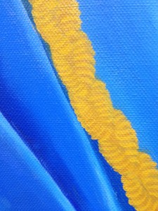
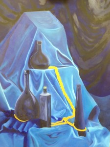
Now, I am in the position where I can look at the painting and ask what makes it better, instead of what makes it structurally sound. Thus, I have been moving folds of cloth around at the bottom, so there is a fall instead of a rumpled piling-up, and I have repainted the cord, moving it a couple of times rather than have it look stiff and unnatural. I think the slight hint of yellow under the blue in that area will be a positive thing, as it will make the gold more glowy.
If you look at the bigger picture, rather than the close-up, you will see that my phone had difficulty with the yellow and the blue in the same frame. That makes for terrible photography, but good painting – the brightness will stand out without me having to make it garish on the canvas.
 It is a big piece, and it has a lot of impact. It also had some technical problems. I oiled the background to bring up the glaze, and had to take off the excess oil after a couple of days, which was Not Fun. However, the background now looks as rich as the rest, but several shades darker. Since taking this large photograph, I have also altered the fall of cloth at the bottom so that it obeys the laws of physics, and deepened the shadows inside the cord so that there is real depth to the plait. It is a three-dimensional weave, and that has to be respected. I then trimmed the edges of the plait back to rounded curves, while I was uniting the various blues on the right of the picture. It is a big piece, and it has a lot of impact. It also had some technical problems. I oiled the background to bring up the glaze, and had to take off the excess oil after a couple of days, which was Not Fun. However, the background now looks as rich as the rest, but several shades darker. Since taking this large photograph, I have also altered the fall of cloth at the bottom so that it obeys the laws of physics, and deepened the shadows inside the cord so that there is real depth to the plait. It is a three-dimensional weave, and that has to be respected. I then trimmed the edges of the plait back to rounded curves, while I was uniting the various blues on the right of the picture.
So far, it has not been as much of a challenge as my self-portrait, in terms of drawing or design, but it has been for colour mixing. Every time I paint in blue, I am starting out with crimson, ultramarine, and cerulean. When painting flesh, mixing to something very close to the last paint used provides vivacity. When painting cloth, it makes for too much texture, and the colour matching has to be far closer than on a human being.
There is still a long way to go, but it is going to be a question of what I can do better, rather than what is not yet finished. The pressure is off the design phase. Now I just need to remember to stop when it is done.
|