|
|
Partly in preparation for a terrifyingly complex art work I have in mind, I made a gold leaf Batman. This was a gift, so it was not published until now, but I executed it a couple of months ago. I spent some time looking at possible poses, and settled on a silhouette. The last Batman I did had the bat symbol on his chest plate, and I wanted to avoid doing exactly the same pose. I learned that you can make the Joker upside down from Batman’s negtive space. Not going there inside a postcard. Would go mad. But it’s a good yin-yang concept, with a bat symbol and a card embedded in the other person.
Beard trimming to get the Bat symbol is a thing. I do not want to live in that world.
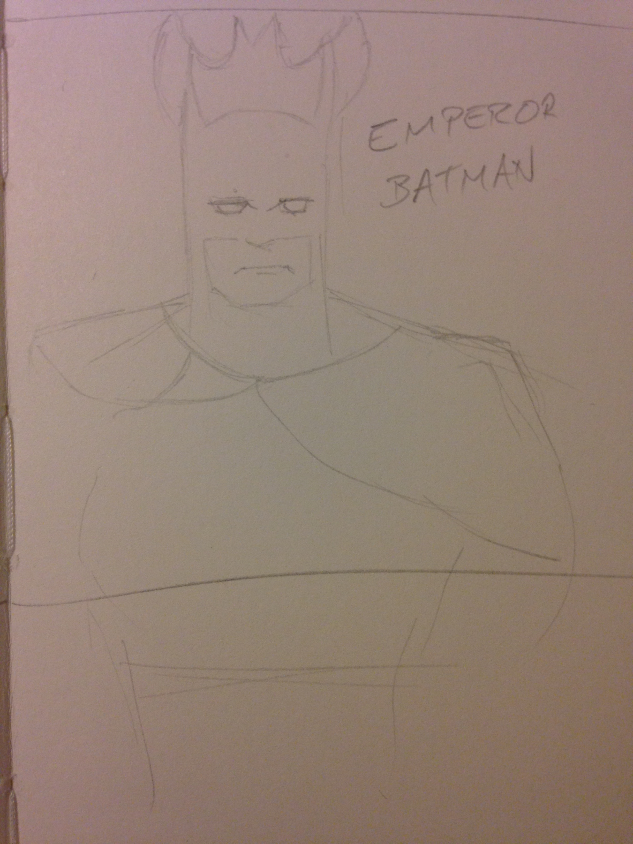
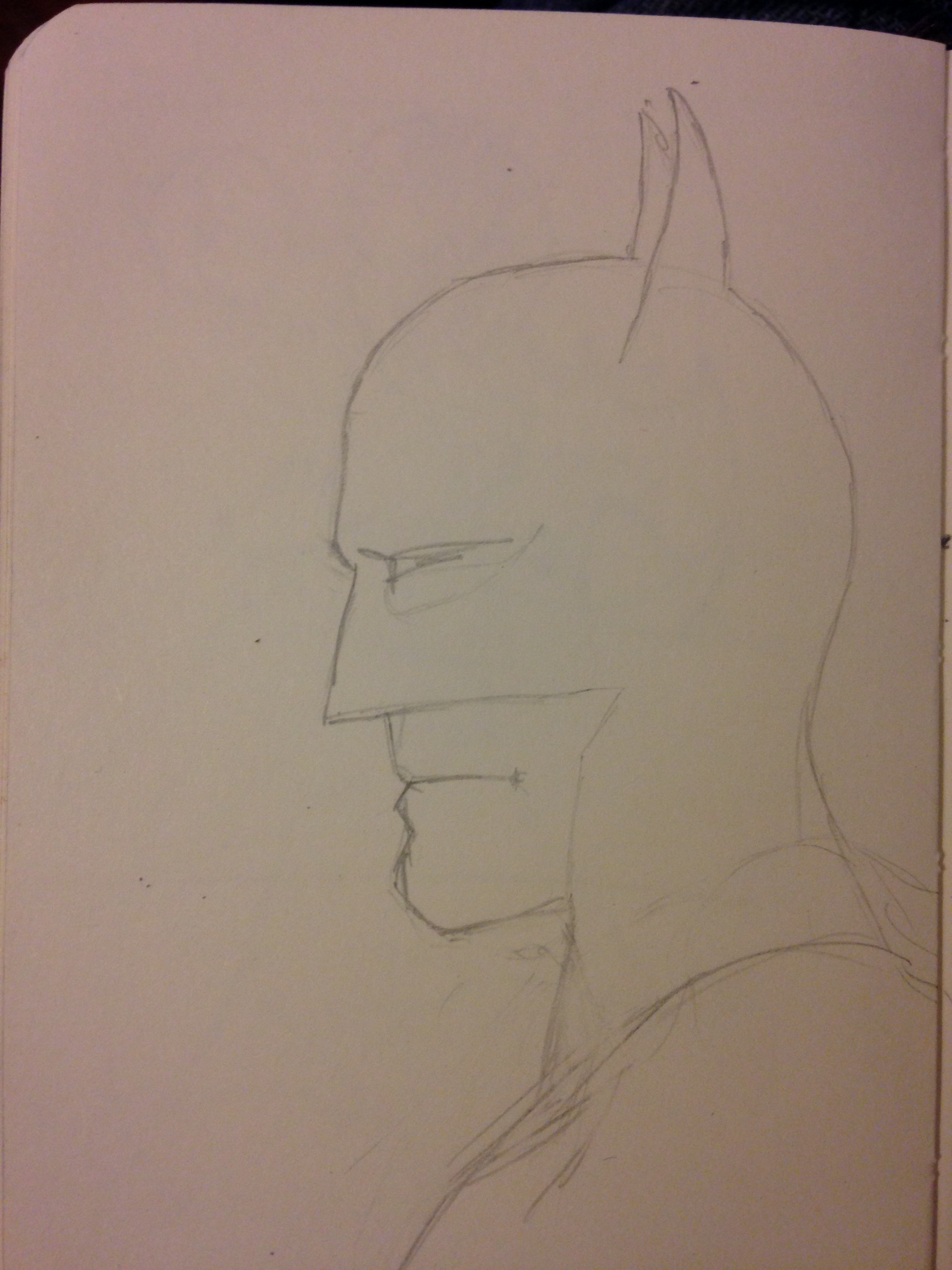
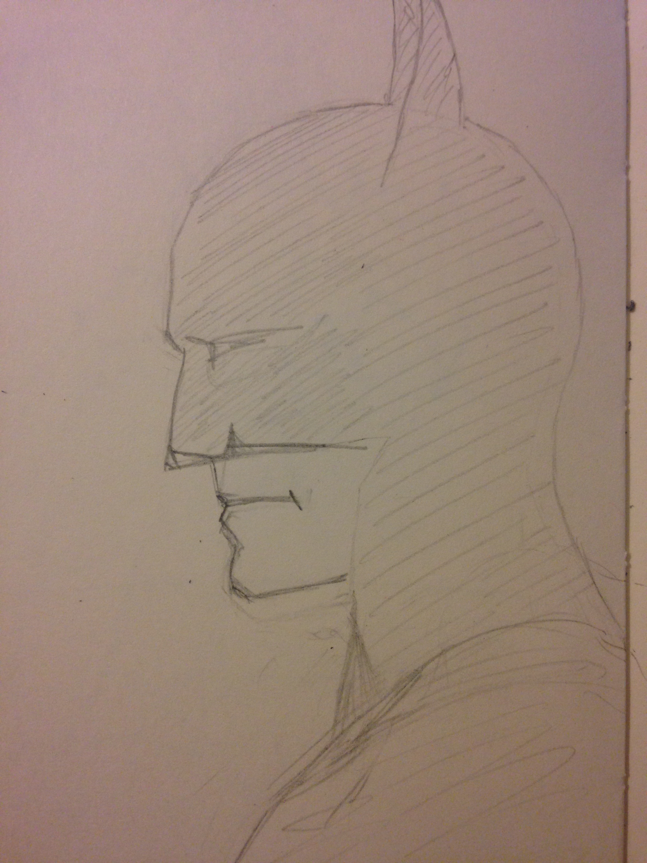
Here’s a set of snaps of the prep sketches I did:
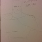 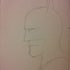 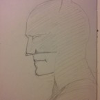 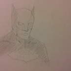
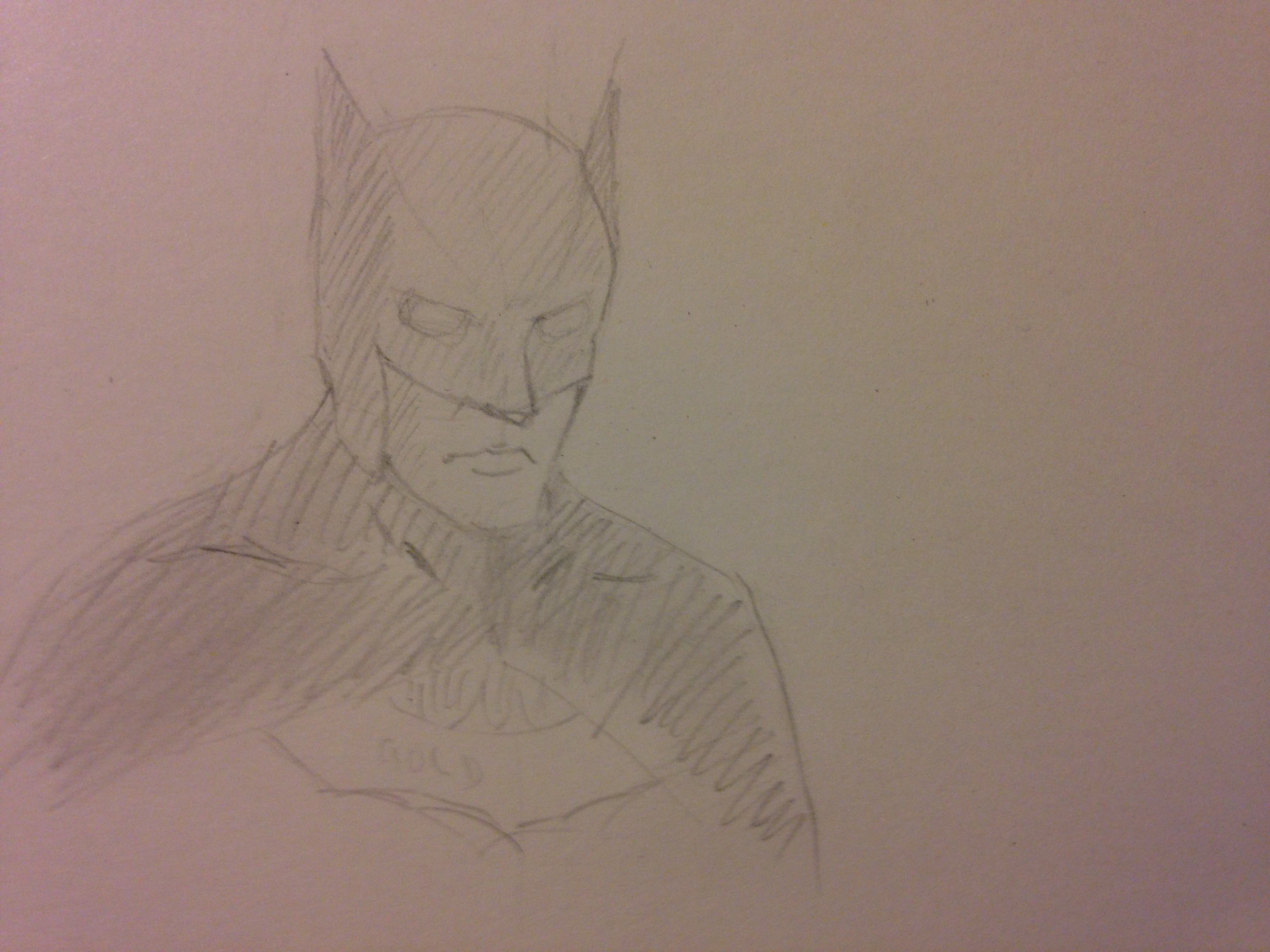
I use sketches to try out proportions and ideas, so they are seldom accurate, but what they are is quick. I chose the fourth one as my pose, and developed it a bit more on sketch paper to be sure before copying it to my watercolour postcard.
I really, really like Batman: The Animated Series. Did you know they did that on black, so every colour emerged from it, instead of designing from white? It gives the whole series a gloomy look which works really well.
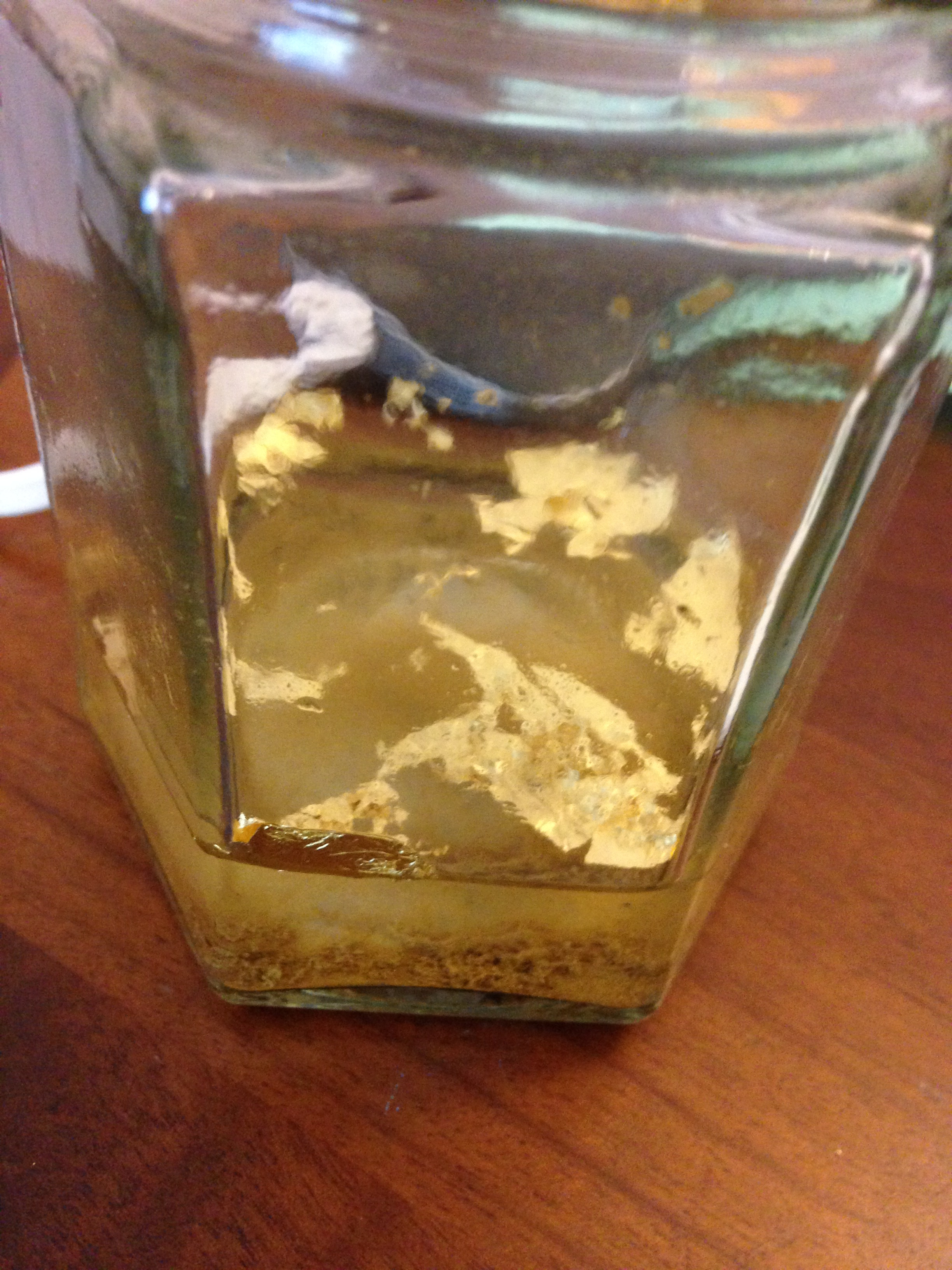
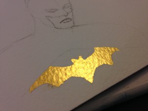
 Gold leafing is /hard/. This photo shows the wastage, and in fact I wasted far more than I should have. I didn’t have a pad to cut on, and I was ham-fisted throughout, but I’m pleased with the result. I used an acrylic glaire, which just needed to be painted on, then dried to give me a surface I could breathe on to make it sticky. Glaire and Gesso and Bole and Clay are all basically excuses to make a mount for the gold, and then make that mount sticky. I used one that would stay pretty flat, and be easy to activate for sticking the gold down. The surface looked beautiful, and even more beautiful when I had burnished it. I did that in a static-proof bag, which is really smooth, rather than using burnishing paper. That wasn’t perfect, but it was good enough and it was what I had. A cutting pad is absolutely required, however. Gold leafing is /hard/. This photo shows the wastage, and in fact I wasted far more than I should have. I didn’t have a pad to cut on, and I was ham-fisted throughout, but I’m pleased with the result. I used an acrylic glaire, which just needed to be painted on, then dried to give me a surface I could breathe on to make it sticky. Glaire and Gesso and Bole and Clay are all basically excuses to make a mount for the gold, and then make that mount sticky. I used one that would stay pretty flat, and be easy to activate for sticking the gold down. The surface looked beautiful, and even more beautiful when I had burnished it. I did that in a static-proof bag, which is really smooth, rather than using burnishing paper. That wasn’t perfect, but it was good enough and it was what I had. A cutting pad is absolutely required, however.
There were slightly ragged edges because I got the burnishing wrong and had to add a bit more gold, but those can be taken off with a scalpel. In this case, I’m not too worried because they are part of the process, and they help people to realise that the gold leaf is real. Otherwise, it is so out of context that it could be overlooked. I did clean up a bit, but not a huge amount.
 I chose Paynes Grey rather than black – it’s a very dark blue-black which will pick out the gold, and it’s also a homage to the blue cape, which I really like as a design. The ears are long in the style of Bob Kane. No etched frown – that’s just silly. I chose Paynes Grey rather than black – it’s a very dark blue-black which will pick out the gold, and it’s also a homage to the blue cape, which I really like as a design. The ears are long in the style of Bob Kane. No etched frown – that’s just silly.
I did a first pass in the pale tone, which has a little cloudiness by the shoulder – I stopped to take a picture, and had to reactivate the dried paint there. However, that was always going to be covered by the darker layer. The gold repels the paint, so as long as I didn’t leave blobs there, I was fine.
The eyes and skin got left as negative space, untoned. It’s particularly good for the eyes. I didn’t erase the pencil marks on the mouth, as they help define it. I had gone in pretty heavily with them, partly influenced by line art and how I remember Batman comics, and partly because pencil on watercolour paper can be shaky, and I had to overdefine to make sure there was something wherever I wanted something.
And, as I said, this was a gift. So you don’t get to see the final painting, unless it was sent to you. I’m evil that way.
—
I’m closed for commissions over Christmas, but ask me about January if you’d like something.
|