|
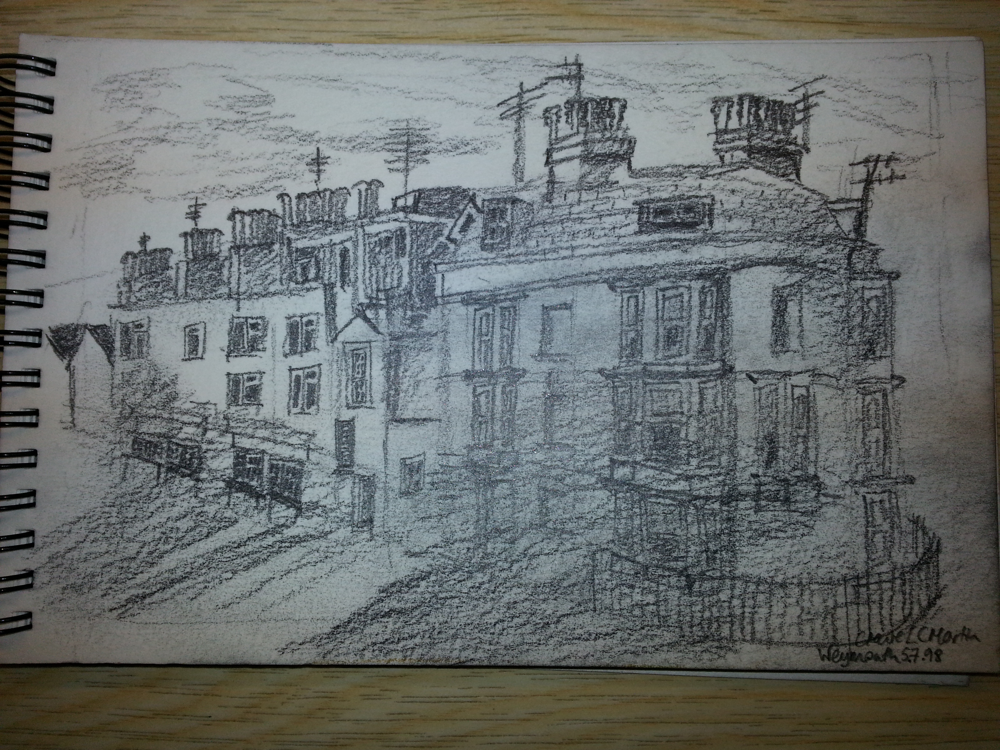
 Hello and welcome to further critique. Those of you who are following along at home will notice this is not a watercolour but a pencil drawing. Again, there are good parts and issues. I like that combination, because it means when you have improved you have something good. Hello and welcome to further critique. Those of you who are following along at home will notice this is not a watercolour but a pencil drawing. Again, there are good parts and issues. I like that combination, because it means when you have improved you have something good.
Obviously, the artist here knows about perspective, but has not quite got everything right. The main lines of the building shrink, but the windows within it don’t. However, given the size of the paper and the size of the pencil, that’s only to be expected. The easiest way to deal with this is to have a perspective point on the paper. Draw any parallel lines that recede to that point, and rub them out afterwards. A building seen at this angle is mostly parallel lines, so you benefit a lot from a little preparation. If you don’t have room (this is a travel art kit) then you can sometimes fake it by marking three or four lines on and just guessing where they will hit. It takes a little more practice, but not a huge amount. Setting up the perspective is very important, and can be complicated. For Queen Elizabeth II’s coronation, one artist who drew it for the newspapers spent 2 1/2 hours on setting up the perspective, and 1 1/2 hours actually drawing. Westminster Abbey is complicated, and was full of people.
The aerial perspective, again, is off. It looks like the artist has spent longer on the parts that are closer (as she should) but has used some of that working time to cloud what we see. The lower level of shadows as the building recedes makes the far part stand out more. The close part is mostly mid tones, and the far part is mostly either light or dark. Reversing that would mean everything closer to the artist looked closer to us.
This looks like it is done on watercolour paper, which is not ideal for pencil, but can give a lovely, urban effect. I tend to have what any normal person would think is far too many notepads. For a day’s casual art I can have three or four different pads of paper on me. That’s too many, and drawing on watercolour paper is a fine way of dealing with the fact that everything has to be carried to a location. It does give a texture to the marks you make, however. Those can be embraced by electing to use the texture rather than fighting it. Urban images, smoke, clouds, everything but perfectly still mirror images can benefit from the texture. It’s a good choice of image, it fits the framing of the paper, and it balances well.
Points to improve:
Aerial Perspective: The distance should be more smudged than what is up close.
Tool use: Sharper pencils would give you precision that you probably need for this.
Perspective: We can actually see where the vanishing point would be. Making sure everything obeys it will make the picture easier to look at.
|