|
|
One of the fans of my art, and someone who has known me from before she knew I could draw, showed me some of her work recently, asking for my thoughts. A direct quote from her: ‘Art lessons at school didn’t include learning any techniques’. Leaving aside my rage at the abandoning of the atelier system in favour of individual expression… She kindly gave me permission to give my answer in the form of a blog. This allows me to expand, and gives other people the benefit of the advice I will be giving.
 First off, I should say I love it when people enjoy creating art. The purpose of critique is to get better in a certain direction; I can do it for classical painting and drawing. If you asked me about abstract art or cubism, I would be blank. If you asked me about Impressionism, I would have to think much harder. Here, then, is a look at someone’s art with a view to improving them in a particular direction. Advice given here is what I would do, rather than what is objectively correct. First off, I should say I love it when people enjoy creating art. The purpose of critique is to get better in a certain direction; I can do it for classical painting and drawing. If you asked me about abstract art or cubism, I would be blank. If you asked me about Impressionism, I would have to think much harder. Here, then, is a look at someone’s art with a view to improving them in a particular direction. Advice given here is what I would do, rather than what is objectively correct.
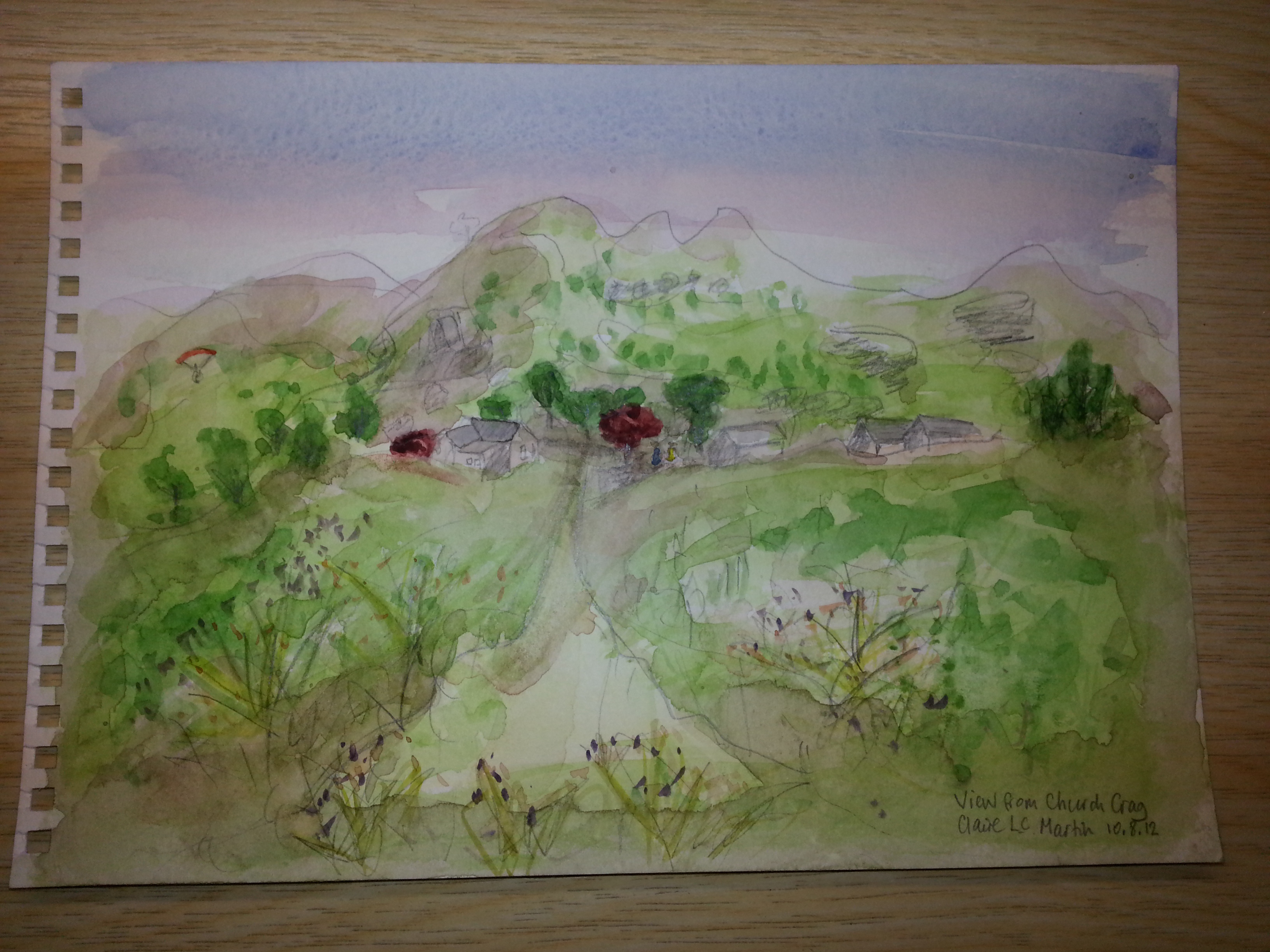
So, over to the left we have a landscape. It’s recognisable as such; you could probably even identify it if you knew the local area. However, it has a few issues. The first is the meeting of the sky and the ground. You can tell where the water ends. There is a good way around that, though. It just takes patience. Unusually, it is the same for watercolour as for oils, which always surprises me; paint the things at the back first, and the things at the front last. It’s not always applicable, but colours at the front can generally be stronger, so they lie over what is at the back, and hide the work you have done. That means you can extend a watercolour sky all the way down through everything else, wait for it to dry, and paint over it. If you use a gradated wash, leaving stronger colours at the top of the sky and paler colours at the bottom, you will not hugely be changing your background for the parts that will not be sky. Extending the sky downwards and putting some colour into the mountains would have dealt with that line. If the clouds go over the mountains, that’s good, but then you need to lose the mountain outline instead. Use lift-out colour, dabbing with a sponge or crumpled tissue, for cloud shapes that are irregular white cut-outs from the sky.
Aside: If you use masking tape (I use mounting tape, which comes off more easily) on the edges of your piece, then you can make sure the paint goes right up to nice square edges, and you never have to stop painting for fear of running off the page. The human eye then forgives the hard edges, because they all line up, so what you have is a view instead of a sudden stop.
The colour mixing is naïve. Nobody is every born knowing how to mix colour. That is a big thing, the second most important thing after drawing. (I like the drawing in this. I really like the view, the paraglider or parachutist to the left, and the triangular shape that runs up to the roofs.) The best advice I can give here would be to make colour charts. This takes an afternoon to do, but it gives you a very powerful tool. You will need a big pot of water, and a small brush, and your paper, and a ruler and pencil. Grid up your paper so you can fit all the paint colours you use across the top, and down the side. Mix up a 1:1 mix of each, and paint it on thickly and then thinly, side by side in each square on your grid. Then, when you want to use a certain colour you can look it up and find out how to mix it really easily. You can also choose only to use things that mix nicely with colours in the first mix you have chosen. This limited palette method means that everything pulls together in your painting. Your greens match your blues and your yellows, and the blue is the same in the sky and in the purple-red of the hang glider. I refer to my colour charts a lot, for watercolour.
The colour mixing comes into play because of aerial perspective. Things that are a long way away tend to be slightly washed out by the atmosphere. They have a blue tinge, as well as being slightly blurry. If you have mixing down as a habit, then a thing that is further away can be painted in a way to make it not stand out quite so much, and to be a little cooler in temperature – the blue tinge. Those two tricks will send something into the distance far better than making it smaller will.
One more thing here that I would change. The mountains are pretty even, and the lump in the middle stands out and surrounds the village, meaning there is no interplay or tension between the background and the midground. I would deal with that by lying like fury. Move the mountain over to the left, add a bit of jaggedness, put in a valley or two where you can’t see the rock because there are trees in the way… I do that to make an aesthetically pleasing view according to rules I have learned and often (but not always) follow. It’s optional, depending on how I feel.
Good things in this picture: the warmth of the sky, the repetition of colour in the village and the cloth sail, the use of different strengths of paint, from dark to light, the composition of the foreground and midground, arguably the mountains (with my caveat above), the lovely springing sharp foreground plants. There is a lot that is good here.
Further critique to come, on other pictures, but I will leave this one here to avoid overloading a single image with information.
|