|
 Edward is a cat well known to me through pictures, and his owner had been pondering a commission for a while. She finally asked me to draw him rather than paint him, as I was coming up to Christmas and the time ahead looked very busy. She had a window for collecting the picture in person. Edward is a cat well known to me through pictures, and his owner had been pondering a commission for a while. She finally asked me to draw him rather than paint him, as I was coming up to Christmas and the time ahead looked very busy. She had a window for collecting the picture in person.
She already had a particular style in mind, after seeing a pencil rough of a picture I was working on, and she wanted the finished item to be in that style. After some thought, I decided to leave evidence of the working method as well. I had asked if she wanted to see the work in progress, but she preferred to be surprised, so I made that decision based on highly technical aspects of my work; I guessed what she would like.
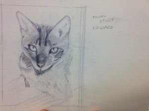
The first version of him was in my sketch book. Almost all of my work has a tonal study before anything else gets done, and the study does not have to be hugely accurate to shape. It is there to tell me where the darkest parts and the lightest parts of the picture are, so that when I come to do the final work, I am not surprised by local variations. It is this step that lets me get the shapes right the second time around, without having to fit both questions of form into my head together. This round of work does let me look at some of the complications of shape, but I do not commit to solving them in the rough pass. Rather, I file them away as problems to remember I am going to have, and then approach them later on.
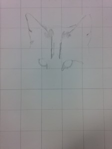
 The second version of Edward was the final picture. To keep the shaping accurate, I used a grid. I also renamed the original picture to include the details of the grid, which is a vital step if you use gridding for a lot of drawings or paintings at once. In this case I was free of other work in this style, but it is a good safety net for me. When drawing or painting from a photograph, you have generally already lost a lot of data. I asked my client for several other pictures of Edward, to let me work out where turning points would be, and then I began on the picture itself. A couple of times I did have to refer to other pictures to find out if a particular drift of fur was where I thought it was, but mostly I could work straight from the picture. The second version of Edward was the final picture. To keep the shaping accurate, I used a grid. I also renamed the original picture to include the details of the grid, which is a vital step if you use gridding for a lot of drawings or paintings at once. In this case I was free of other work in this style, but it is a good safety net for me. When drawing or painting from a photograph, you have generally already lost a lot of data. I asked my client for several other pictures of Edward, to let me work out where turning points would be, and then I began on the picture itself. A couple of times I did have to refer to other pictures to find out if a particular drift of fur was where I thought it was, but mostly I could work straight from the picture.
Starting at the top to avoid my hand smudging the picture too much, I drew in the darkest parts of each area, and very little else. Sometimes, when the darkest parts were too light, I left them out entirely. Sometimes, I added them in for clarity. As an example, his ears are much lighter than the dark fur in the centre of his forehead, but I wanted to have the ears in to be sure I had their positioning correct before the paper was covered in marks. I was after clarity, and not smudginess.
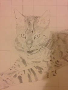
So, of course, I smudged it on purpose. Where there was darker fur, I used a compressed paper roll to work the graphite into the surface, so that all of the white was covered. This made the area much darker. Then, for consistency and final effect, I went over that with the same pencil and then a slightly darker one, to add the sharpness I felt the client desired. It could therefore look like a quick sketch, but also have solidity.
 The early, blank-eyed Edward was my favourite stopping point in the process. However, the final picture had eyeballs, and so was probably better. I snapped it with an iPhone (this picture here), and put it away for a couple of weeks, as I had been staring at it for too long. When I took it out again, I could spot the mistakes easily and rectify them, and then I showed it to my client. Thankfully, she recognised her cat, which is always a good thing. The early, blank-eyed Edward was my favourite stopping point in the process. However, the final picture had eyeballs, and so was probably better. I snapped it with an iPhone (this picture here), and put it away for a couple of weeks, as I had been staring at it for too long. When I took it out again, I could spot the mistakes easily and rectify them, and then I showed it to my client. Thankfully, she recognised her cat, which is always a good thing.
Somewhere, I am sure I have a picture of the finished article. Let’s all just pretend I did not forget to take it.
|