|
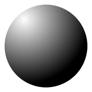
 If you are having trouble with painting, one way to do things is to isolate the problem so that you have a very very simple piece of work, and can get your brush strokes right. Here we have a sphere, which has a light on the top left. The spotlight and the darkness underneath give an entire range of colour values. You can make the white into any pale colour, and the black into any darker colour, and the spherical look still holds. I made it by using a circle shape and an offset radial fill in gimp; the same would apply in photoshop, so if you want to test the method, you can find colours that look OK. You can also do anything you like with that sphere up there; if it helps you to look at it or go around it with a colour picker, do that. If you are having trouble with painting, one way to do things is to isolate the problem so that you have a very very simple piece of work, and can get your brush strokes right. Here we have a sphere, which has a light on the top left. The spotlight and the darkness underneath give an entire range of colour values. You can make the white into any pale colour, and the black into any darker colour, and the spherical look still holds. I made it by using a circle shape and an offset radial fill in gimp; the same would apply in photoshop, so if you want to test the method, you can find colours that look OK. You can also do anything you like with that sphere up there; if it helps you to look at it or go around it with a colour picker, do that.
For practice, spheres are very easy to paint – you can draw around a cup on paper, or you can eyeball it, and because it is definitely practice, it is hard to get wrong. You can throw it away and try again, or dry it and paint over it, saving your materials and learning the feel of paint over paint.
If you are practising brush strokes, try out the difference between strokes going around the light, and radial strokes away from it. You can use big, bold strokes. You can even paint with paper taped to the canvas to give you your shape, and pick it up afterwards, if your surface is smooth. The idea is to reduce the image to the simplest thing you can do.
Try that in black and white, and then select three colours, a mid tone, a dark tone, and a light one. Make the light one have a hot or cold tint, and make the dark one have the opposite. That will help to differentiate between light and dark in a way that just black and white won’t do.
A sphere is the simplest shape to draw 2D, but 3D it contains a curved surface so that every part is at a different angle to the parts nearer to or further from the light. Cubes and cones and prisms are also possibilities, with or without shadows. The idea is just to get used to paint handling and tonal differences.
|