Painting with Heat
|
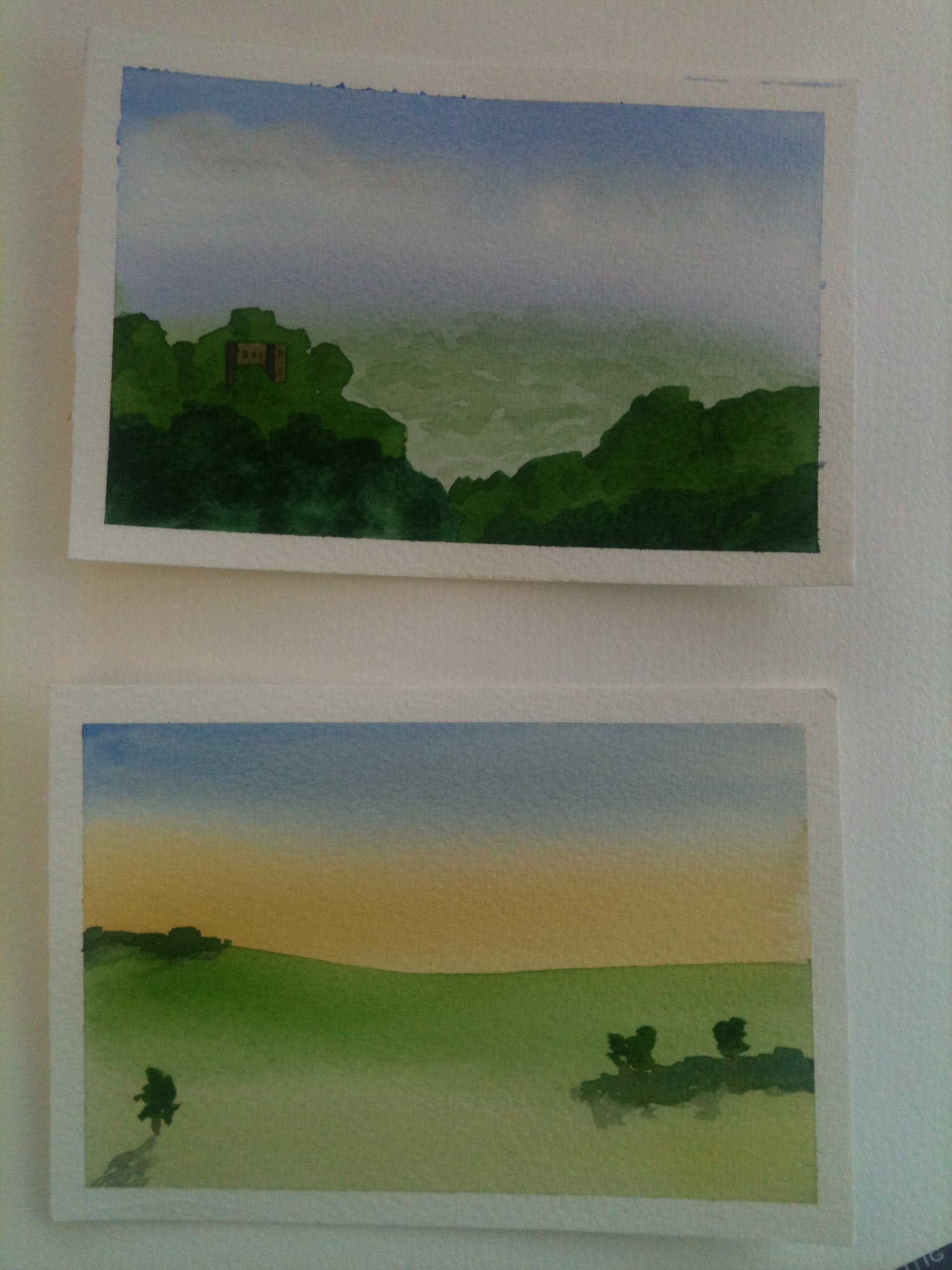
Around the colour wheel, there are cooler and warmer colours. This may not be immediately apparent, and it is a psychological trick. We associate ‘heat’ with orange and red and yellow, ‘cool’ with blue and green. Fortunately, those colour arcs sit pretty much opposite each other, and it is probably important that they use different cones in the retina, but at that point my knowledge breaks down. The functional thing to understand is that people who view your art will differentiate these things, and probably not know that they did. This is a good piece of information to have. Look at the two postcards I have here. Both were painted by the same basic method; I wet the paper, took off excess water to leave only a sheen, and then added the sky. In one case, I used a sponge to take out clouds. In the lower card, I did something more interesting. I added pale ochre for a distance sheen and a sunrise, and I brought the ochre (a yellow paint named after a sort of ground rock) right down to the front of the paper. There is not much of it there, but under the green it is there. Where you see the yellow coming through in the dip that leads up to the hill, that is ochre. On the upper postcard, I used aerial perspective – the effect of a distance blur – to make a valley full of misty trees. I used that trick all the way back, so in fact the purple band of distance is another part that I put in with the sky, and brought right down. In this case, it tapered out so effectively that it cannot be seen. Then I painted more and more sharply as I got closer to the ‘front’ of the view. The foreground is generally the bottom of the frame, but in a cave, or a building, that could in theory be different. So both of these have effects that are to do with heat. The ochre (and a bit of lemon yellow) in the grass pulls it forward. The purple that is half sky and half trees in the distance makes the far part of the forest recede, even though it is blue plus red. While the red heats the sky, it also sits as something blue-shifted on the horizon line, and therefore pushes back the valley. I know the cards were successful, because someone said to me ‘that looks really like it is coming out towards me’. So I explained, and the magic was still there. I sell these cards by sending them through the post, so if you want to study one in person to study or as mountable art, feel free to ask, in the comments, on the Contact Page, or by Twitter, where I am @DianaProbst. |