|
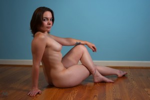
 To the left, and immediately making this post NSFW, is a nude. This is a stock photograph, but I think it is a very good base painting or drawing. I could easily have a model in this position, and it would make for an interesting image at the end. The reason I like it so much is that there is a combination of curves and lines, and the position is well-balanced. Look at how the curves are distributed all around the image, and lie like brackets around all of the straight lines. To the left, and immediately making this post NSFW, is a nude. This is a stock photograph, but I think it is a very good base painting or drawing. I could easily have a model in this position, and it would make for an interesting image at the end. The reason I like it so much is that there is a combination of curves and lines, and the position is well-balanced. Look at how the curves are distributed all around the image, and lie like brackets around all of the straight lines.
There are many ways of introducing balance into a picture. In this case, given that humans have limbs and limbs back joints, it is easy to make one big triangle shape that can be split up into others. However, without the waviness of the limbs, that might as well be geometry. Look at the curve of the rib-cage, up to the breast, or the front part of the upper torso. It is a series of arcs and curves that could be beautiful even if abstracted, but it would also lose some of its strength. Where does the strength come from? I discussed this with an external node of mine, Cortez (stout fellow).
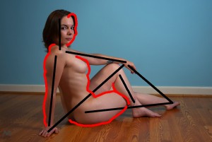
 On this picture, I marked some major triangles, which are strong shapes, and some of the big curves. The soft form on top of the arm, for example, would be very different on a robot or a statue made of sticks. I gave Cortez the exercise of looking for other straight lines or strong internal curves. On this picture, I marked some major triangles, which are strong shapes, and some of the big curves. The soft form on top of the arm, for example, would be very different on a robot or a statue made of sticks. I gave Cortez the exercise of looking for other straight lines or strong internal curves.
Her dark eyebrows help to balance her face. Does her outstretched foot naturally point like that?
The face is interesting. Not everyone’s faces go with their bodies, but in this case it’s a good match. The curvy nature keeps her looking alive despite the sedentary pose. It’s a good image of a person as well as a good image in terms of colour and construction. And no, the foot is done on purpose. There’s some tension here, and a more relaxed pose would have the feet up and the nearer hand splayed. That would mean that the limbs ended in lumps, rather than in points. It would be less graceful.
The tats go with her body too. The line of her back is parallel to her leg. Does that count as a strong line?
None of these things are necessarily designed, although I would be surprised if her feet were not. It’s not all conscious, but it will be put there in purpose because it looks good. The parallel lines definitely add strength to the middle. But if they had not been there, this might not have stood out, so sometimes you can get good design by filtering away what is bad. In this case, though, I think the photographer made several choices.
Does someone arrange the model then?
Oh hell yes.
What’s wrong with the way people arrange themselves naturally, then?
It doesn’t look as good.
There is a school of thought on that, isn’t there?”
Yes. The naturalists are wrong.
Er, that is, for a certain value of ‘wrong’. One that I believe in when I paint. Ask me again about different art forms.
Anyway. The model may point her feet and move her fingers right, but she is unlikely to have enough body awareness to see from the outside where all the parallels are, and where the strengths are. If you look at the shoulders and the way the arms are almost at right angles, that is the observer’s decision. Equally, the twist of the body has the observer looking through from one shoulder to another, which is flattering if the shoulders are straight and strong. With the twist that means we can see more weight at the bottom of the spine, which is the base of the human part of the image. Try rotating that mentally until you can see the chest from an angle and the buttocks from the side.
This is different, say, from the current fashion in portraits where they prop you at a bizarre angle. The only unnatural thing I notice about this photo is that her back is straighter than most people would do.
Good spot, it is. Backs are round in a way a lot of people don’t look at. If she’s holding a pose for a while, though, she wants to do that. It’s a lot easier to sit straight than to hold a slouched pose. But her left leg would not be where it is if she were just relaxing. Still, you could imagine someone sitting like that and talking, in non-strange circumstances. I like that sort of pose. My aim is always to get something that looks like life, but a little bit better.
It is a mostly natural sitting pose, if you try it. Perhaps with the other leg bent as well.
But then we lose the strong triangle. I’d only sit like that against a wall, so I could lean my shoulders back. Let me show you a man’s arabesques.
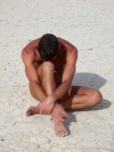
 This one is arranged as well, I suppose? It’s more angular than the other. This one is arranged as well, I suppose? It’s more angular than the other.
Indeed. The lighting and shadow, I’m not sure about, but it seems to me that the light is from the side without the knee sticking out, so the shadow fills in the shape.
The white ground is a neat touch. I wonder why the front leg is not straight, though.
If it stuck out, he’d look like a lollipop. His leg is bend for the same reason his head is down. The key to this pose is compaction.
It leans left, though.
True, dat.
Stop that. You are not allowed to use slang.
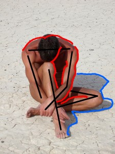
Sorry. But it’s true. However, consider the options. If the shin is upright it will either be central or out to the side. If it’s central we see the thigh, drifting across the chest. Another reason not to move it, and a good one, is that it’s parallel to the arm. Parallel lines are strong and in this case act like bars, but thin triangles can clash. Let’s look at it with some lines on.
 If you moved the camera towards the fallen knee, you might get it vertical, but then the other parts would move out of symmetry. This depends a lot on the upper arms, the shoulders, and even the bump of the head, which gives us the line of symmetry. If you moved the camera towards the fallen knee, you might get it vertical, but then the other parts would move out of symmetry. This depends a lot on the upper arms, the shoulders, and even the bump of the head, which gives us the line of symmetry.
I noticed the veins first, and then the definition in the arm muscles.
I noticed the collarbones. The upper half has very strong symmetry. But different people do see different things. A lot of the history of art is learning to look with eyes that see like somebody else. Thanks for the talk, Cortez.
No problem. Say, have you seen the Pacific around here anywhere?
|