|
Today, the towel had to be brought up to a decent level of completion. I went back through my notes and found that I had used viridian, a cool blue, and white on the far part, with a few warmer colours on the part over the left shoulder. That is further from the light source, and also closer to the viewer. Both of those things make it warmer on the canvas, as the light was cool and coolness retreats from the picture plane.
I have a very serious problem with the towel. So far, it has a smooth surface. If I get a rough surface wrong, it will look like shaggy fur, and that is a bad thing. Drying your hair with a wolverine sounds to me like a very bad idea.
I will repeat that for those who are unsure: For the love of sanity do not dry your hair with wild animals. It only makes them furious! Ahem.
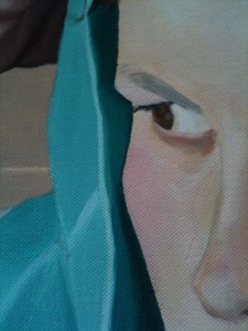
 I used the towel to shape the face, smoothing down the cheekbone, and bringing the chin in a little, but it was not quite enough, and more needs to be done. This is fine, as I have not finished the towel anyhow. I need to do at least some texturing work. Having done a little here and there, I think I can suggest it without overdoing it. I used the towel to shape the face, smoothing down the cheekbone, and bringing the chin in a little, but it was not quite enough, and more needs to be done. This is fine, as I have not finished the towel anyhow. I need to do at least some texturing work. Having done a little here and there, I think I can suggest it without overdoing it.
The picture to the left is partway through the reshaping, with the angle still hard but the right tone established outside it. The method I use for checking in this instance is to take a picture of the whole canvas, and match it to the original photograph. Then I invert the colours and make it 50% transparent. Anything that has an abrupt colour transition is easy to spot, and wrong. A photograph is not and should not be the same as a painting, but for portraiture it is very helpful in establishing a likeness. There is a slight yellowish cast over grey, on the finished part, meaning that the painting is a little warmer than the photograph, and I am in favour of that.
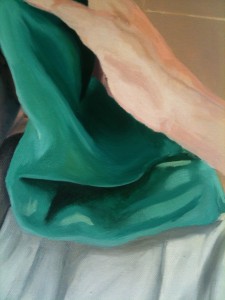
 The picture to the right shows the unblended colours over the green towel; what you cannot see there, because it is also green, is that I have wet paint all over the area. The bits that stick out are the yellowish flashes down at the bottom and out under the wrist. There is a touch of reflection of the slightly yellow light in the main area of the bathroom, and to have it explicit in the colour mix here will tie the towel into the background a little. This means it will belong to the same image, and not look like an afterthought. The picture to the right shows the unblended colours over the green towel; what you cannot see there, because it is also green, is that I have wet paint all over the area. The bits that stick out are the yellowish flashes down at the bottom and out under the wrist. There is a touch of reflection of the slightly yellow light in the main area of the bathroom, and to have it explicit in the colour mix here will tie the towel into the background a little. This means it will belong to the same image, and not look like an afterthought.
The hand was reshaped a little, because the underside of the thumb had not got enough definition in my original sketch, and now I could see that I had made it too large. The towel also extended a little further across the ear, and I put in shadows for moving a finger slightly, where one of my earlier measurements had gone wrong.
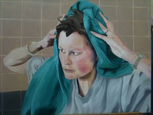
Then I did a lot of blending, and called it a day:

The bluish cast on the towel here is mostly to do with the photography and the lighting conditions, and it looks far better, and rather more like detail 2, on the real thing.
|