|
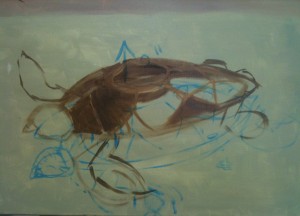
Day 2 of the turtle painting had me putting the pigment two inches further up than I had originally planned, nixing a design problem.
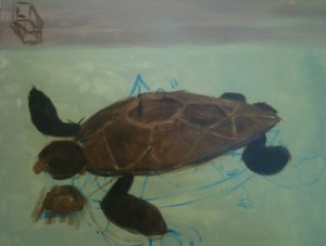
 At this stage, the shell looks very dark indeed, against the pale sea. This is in part an artefact of the photography, and in part how the human eye will perceive it. I was using umbers for the darker browns and ochres for the lighter ones. In this case I could have mixed toward the brown colours using my usual six-colour palette, but it would have been a waste of energy, and probably of paint as well. I only have six colour pots, plus black, and white, for a total of eight pots, and those keep me from getting too many tubes out and forgetting what I have mixed. Sometimes I photograph my palettes when I have a mix I want to preserve. At this stage, the shell looks very dark indeed, against the pale sea. This is in part an artefact of the photography, and in part how the human eye will perceive it. I was using umbers for the darker browns and ochres for the lighter ones. In this case I could have mixed toward the brown colours using my usual six-colour palette, but it would have been a waste of energy, and probably of paint as well. I only have six colour pots, plus black, and white, for a total of eight pots, and those keep me from getting too many tubes out and forgetting what I have mixed. Sometimes I photograph my palettes when I have a mix I want to preserve.

The completed turtle has shell markings even though these will be covered, so I can be sure I will put things in the right place later. I could have left construction lines instead, but the shell plates were easier, and might be useful for features like the houses. I am still mentally settling on a scale. I would like it to be absolutely massive, but that is harder to convey than I like, and would mean adding mountains to the shell, which while cool may not be possible. I will draw up a few mock-ups, and maybe this can be a young turtle instead of an ancient one. I get to make up the biology, after all. Maybe it has very small mountains that have not grown yet.
Embarrassingly, I added in an extra head – I lost track of what I was painting, and started in on the old guide lines. That will get covered, but I am not going to say it was just for practice. It was a genuine mistake, and the head is not connected to anything. It did occur to me that it might make a decent shadow, but up on the top left you can see where I put the light box to tell me the angle of falling light. The sun is behind us, and a little above. I have to be careful that shadows match that.

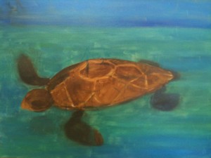
In the finished article, you can see that the turtle shell looks far lighter, because the sea is darkened down. The iPhone is not a good camera for fine art photography, but it is good at picking out different colour areas for me, and I sometimes use it for that.
The shadow of the turtle’s head now looks awesome. I intend to have the turtle in shadow seas if possible, just to keep the shadow effect. The far front flipper looks too long, and the one closer to us looks too short because of the foreshortening angle. I will make it bigger. I like how this is going as a relatively low-stress piece compared to the self-portrait that is on the other easel.
Memo to self: get more easels.
|