|
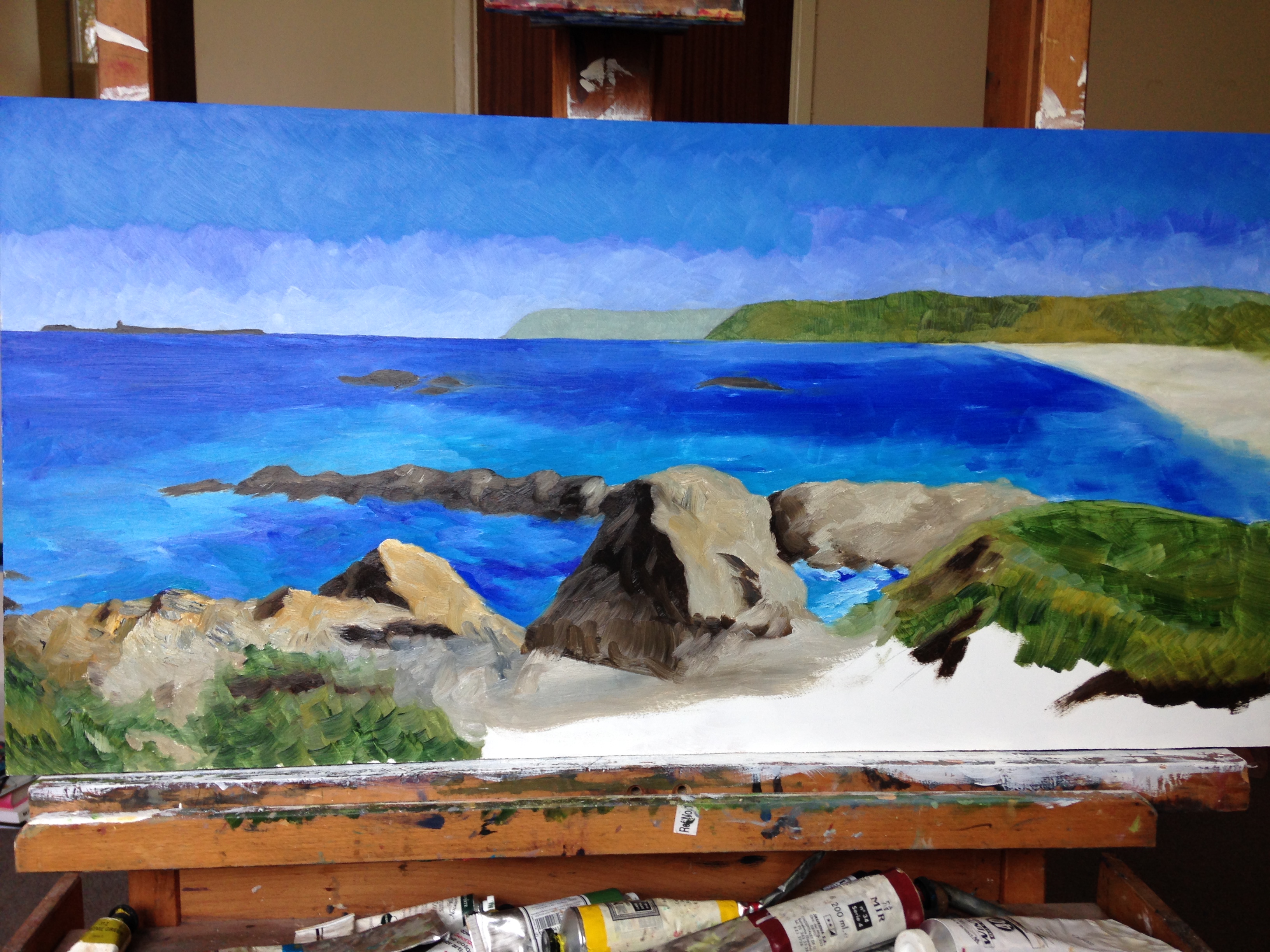
 This is day two of painting a view of Anglesey, after the first day’s work has dried. Previously, I had left the work with some of the sea painted, and none of the foreground. The centre of the foreground stayed unpainted for quite a long time on day one, as I was going to have to paint a drift of rocks. By the end of the first day I had the rocks down, and I came back to the canvas in about the state you see it here. The rocks had been painted with a bristle brush instead of my usual Prolenes, giving them much more texture than the distant sea. I also did the closest part of the sea with the same stiff brushes and very little paint mixing, reloading the same brush again and again. At this point it was still an unbalanced picture in terms of colour, but I knew that I could deal with most of that in the second pass, and a third day would let me finish. The only big unsolved problem was the drift of pebbles close to the viewer. Those could not happen without me finishing the rest, so I knew how to put the right colours in the right places. This is day two of painting a view of Anglesey, after the first day’s work has dried. Previously, I had left the work with some of the sea painted, and none of the foreground. The centre of the foreground stayed unpainted for quite a long time on day one, as I was going to have to paint a drift of rocks. By the end of the first day I had the rocks down, and I came back to the canvas in about the state you see it here. The rocks had been painted with a bristle brush instead of my usual Prolenes, giving them much more texture than the distant sea. I also did the closest part of the sea with the same stiff brushes and very little paint mixing, reloading the same brush again and again. At this point it was still an unbalanced picture in terms of colour, but I knew that I could deal with most of that in the second pass, and a third day would let me finish. The only big unsolved problem was the drift of pebbles close to the viewer. Those could not happen without me finishing the rest, so I knew how to put the right colours in the right places.
 As I formed the seascape, I kept in touch with my client, Brother B, via Facebook message and Dropbox, taking instructions as to how things had to look. At one point, unable to describe the shape of a curve, he followed my suggestion of scribbling on a work in a paint program. Communication is key to giving the client what they want. Brother B’s communication was top notch throughout, allowing me to paint once and only once. Here, you can see the reshaped beach and a rock he added. In general a client who puts in extra geological features is one who is hard to work with, but not only was the rock good for the picture, it was also appropriate to the original landscape. As I had asked for the guidance, I let that one pass. For the grass, I used a flat colour and then painted into it in green, and then painted over it angrily and used a different set of flat colours. Amazingly enough, this worked pretty well, as long as I used short brush work and paid attention to direction. The plateau to the right has horizontal drifts and most other grassy parts follow the vertical portions of the rocks they cover. As I formed the seascape, I kept in touch with my client, Brother B, via Facebook message and Dropbox, taking instructions as to how things had to look. At one point, unable to describe the shape of a curve, he followed my suggestion of scribbling on a work in a paint program. Communication is key to giving the client what they want. Brother B’s communication was top notch throughout, allowing me to paint once and only once. Here, you can see the reshaped beach and a rock he added. In general a client who puts in extra geological features is one who is hard to work with, but not only was the rock good for the picture, it was also appropriate to the original landscape. As I had asked for the guidance, I let that one pass. For the grass, I used a flat colour and then painted into it in green, and then painted over it angrily and used a different set of flat colours. Amazingly enough, this worked pretty well, as long as I used short brush work and paid attention to direction. The plateau to the right has horizontal drifts and most other grassy parts follow the vertical portions of the rocks they cover.
Other things I did over the course of the day were to do with shapes that were already present. I made the skerries pale and blended them into the sky and the sea a little, I added distant texture to the headlands, repainted the sky entirely, going over it with a second layer in the same style as the first, but with slightly different brush strokes. That made it more diffuse and helped it to recede, as it became a little harder to focus on the strokes and the colours at once. The rocks approaching the big central rock were given proper dimensions, and the front of the sea was fixed to approach them without ruining the liveness of the paint that was already there. The waves at the front of the finished piece are the first layer of paint, which was my plan all along. The same applied to the rocks on the left, but the central rock had to have more.
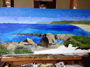
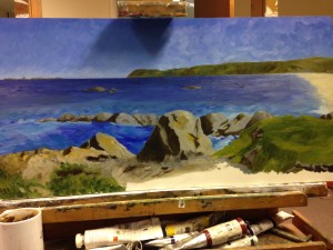
At the end of the day, my client had a suggestion that the house had to be larger and the lighthouse smaller. I had nothing that was not wet paint within four inches of either of them, so I shelved that idea for the next day.
|