|
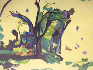
 Today’s painting was easier than the last time I took down this image. After feeling I could never do more than dab at canvas again, I came in early and worked late. There is a tendency to think of forests as green, and green is a really depressing colour to have to blend over and over again. This is not a green painting, but it seems to be one, which is impressive. All of the blues are dark, and the greens are light, bright, and warm. This makes them come forward and be noticed. (Click on the picture to see the larger version of it. It is worth looking at.) In addition the purple and blue hidden or half-hidden in the tree trunk makes the green stand out far more. This is very much a designed picture. Today’s painting was easier than the last time I took down this image. After feeling I could never do more than dab at canvas again, I came in early and worked late. There is a tendency to think of forests as green, and green is a really depressing colour to have to blend over and over again. This is not a green painting, but it seems to be one, which is impressive. All of the blues are dark, and the greens are light, bright, and warm. This makes them come forward and be noticed. (Click on the picture to see the larger version of it. It is worth looking at.) In addition the purple and blue hidden or half-hidden in the tree trunk makes the green stand out far more. This is very much a designed picture.
 The curve in the top left tree branch has a lovely blue under it, one that I only worked out how to mix most of the way through the day’s painting. It is a mix of ultramarine, cerulean, madder, and titanium white. The use of the red makes it much brighter than it would otherwise be, and the blue stands out because it is subtly purple. Fortunately the blue is largely missing from the lower area, or I would have to go back, re-undercoat, and repaint. The curve in the top left tree branch has a lovely blue under it, one that I only worked out how to mix most of the way through the day’s painting. It is a mix of ultramarine, cerulean, madder, and titanium white. The use of the red makes it much brighter than it would otherwise be, and the blue stands out because it is subtly purple. Fortunately the blue is largely missing from the lower area, or I would have to go back, re-undercoat, and repaint.
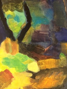
To the right you can see the ground in close-up. The high chroma paints that were available to Cezanne have been made more stable and stronger over the past hundred years. I can paint this really bright, and I want to. I want it to be vibrant and alive, which means dark darks, and bright, hot mid-tones. Up close it is a set of disjointed colours that come together from further away, for impact. On close examination, there will be brushwork that blends and defines.
As always with my painting some areas will be in a near-finished state, while some will be skeleton, ready to have more solid colour attached.
|