|
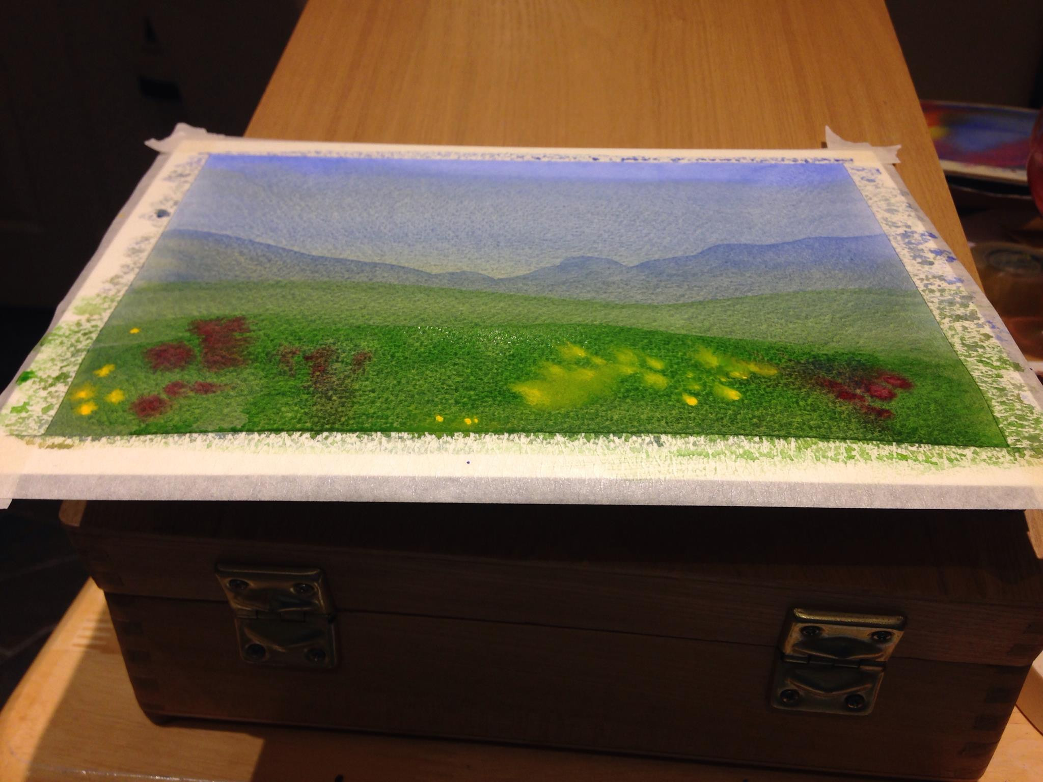
 Here, I have a landscape in watercolour. It is pretty simple, and my intention here is to talk you through it. It is mostly made up of washes. Here, I have a landscape in watercolour. It is pretty simple, and my intention here is to talk you through it. It is mostly made up of washes.
A wash is a thin layer of paint that goes on and then dries over an area. So far, so good. However, it’s hard to make watercolour go on flat. Watercolour paint is basically a glue with pigment in it, and the pigment can either be soluble in water or not. Either way, the amount of water you put in makes a big difference as to how the paint goes onto the page. So, I mix up the paint pretty strongly and then water it down in a separate pot and test it on paper until it dries right. Watercolour always looks darker when wet than when dry, so bear that in mind.
Get plenty of paint of the right strength, and a soft, floppy, absorbent brush. You want to put on as much paint as the paper can bear, because we have a secret friend here. We’re not going to spread it ourselves. We’re going to let gravity do the work. We’ll prop up the paper at about fifteen degrees. If you don’t have an easel that lets you do that (I have, at last count, three…) then making a pile of books behind it is fine. Then get your brush really wet and go over from left to right. If you’re left-handed, go from right to left instead. You want to be able to see what the brush is doing. The angle should be about right to make sure the paint just drops off, but the most important thing by far is that you have enough paint.
If you’ve got enough, it should form a ‘bead’ along the bottom, where the paint flows down. The next time you draw your brush along, in the same direction as before, do it towards the bottom of the bead, but not off it. Keep reloading your brush as you go. At the bottom, dry your brush and dip it into the bead to take off excess liquid. You can also use kitchen towel, but dip gently and don’t scrub. Then let it dry. That should be a flat wash.
I did a flat wash of two colours for the sky. I started off with blue, and then added yellow as I went, so the colour changed as I went down the page. That takes a bit of practice, but mostly the practice is about being fast enough that nothing dries while you’re mixing. It’s not much harder than a flat wash. I also did a postcard at the same time, of the same sort of scene, so I wouldn’t waste paint. Then, once it was dry I went back to the pure blue and painted the hills. I put in the irregular shape with the top of my brush, so I did not round it off too much, and then from the bottom of the irregular shape I did another wash all the way down the rest of the page. That meant I wouldn’t have any lines where the paint had dried, which later showed through.
On top of the blue I did a couple of layers of green with the same technique, making the shapes and then washing downwards. Into the last green I dropped some colour to let it spread. ‘Dropped’ here means that I had really thick colour on my brush, and I touched it gently into the green and let surface tension do the rest. In the whole painting, the toughest part was making sure the distant hills were irregular, because humans are bad at painting irregularity.
—
If you like this explanation and want to see more of my work, browse my portfolio or check out my Etsy shop where I put watercolours and small items for quick sale.
|