|
|
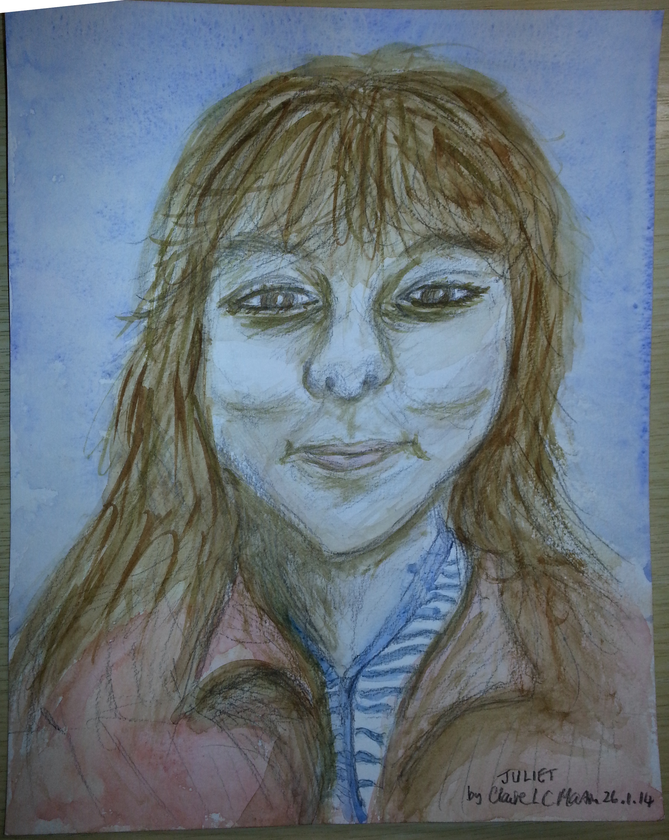
 This is not, strictly speaking, a holiday picture. However, it is from the same artist, so it comes in by the door marked ‘holiday’ and gets treated as such. It’s a portrait. I’m good at portraits. I know exactly how difficult different bits of them are, and how to approach them. Generally, I find a whip and a chair work well. This portrait has a lot of things that can be improved. It is not a judgement on the artist, but on how to make the art better, for someone untaught. Looking at the picture, I can see a mixture of knowledge and ignorance. A lot of the typing below is actually about the same problem, which crops up again and again, but I’ll address it each time, rather than just listing it. This is not, strictly speaking, a holiday picture. However, it is from the same artist, so it comes in by the door marked ‘holiday’ and gets treated as such. It’s a portrait. I’m good at portraits. I know exactly how difficult different bits of them are, and how to approach them. Generally, I find a whip and a chair work well. This portrait has a lot of things that can be improved. It is not a judgement on the artist, but on how to make the art better, for someone untaught. Looking at the picture, I can see a mixture of knowledge and ignorance. A lot of the typing below is actually about the same problem, which crops up again and again, but I’ll address it each time, rather than just listing it.
The first question is whether it looks like the subject. Well, you could use this to pick someone out of a line-up. It’s got all the right parts. However, it also has several of the errors I would expect from a beginning artist. Some of these are easy to spot, but most of them are not actually easy to correct. Vermeer, a Dutch master, could not paint noses. He had spent a lifetime working.
First off, a confession. I opened this up in gimp, and stretched the original photo of the picture so that it was squared up. This plus the photography may have altered the original a little. However, I am not particularly going to talk about representation so much as method, which is where I generally concentrate. There are a couple of simple things to note that can take a lifetime to practice. First, there are hard lines where there should be soft colours. This is most obvious over the nose. Noses are not outlines. Noses are notoriously difficult collections of folds, bumps, and subtle shadows. On this picture, I can’t tell where the lighting is. On the original, the light falls from the left over the nose in a curve that helps to define it, but there is still a problem of shadow. A different photograph with more dramatic side lighting would help here. For a quick fix, decide whether something is light or dark, and then stick to that. Avoiding mid tones is the easiest way of cutting out a lot of awkward lines and adding drama. The same thing would work for the cheeks. The original photo has softly rounded, young cheeks. The lines where there are extra shadows here could well be lost, and the picture would benefit.
The hair, I rather like. It’s got the scraggly look of real hair, without being over laboured. It could benefit from shadow cast by what light there is. Even if the shadow isn’t there, you’re allowed to lie about it. Darken the hair on the right, and leave paler highlights on the left. The clothes are also well presented, but they show one of the underlying flaws here. Watercolour has many styles, but they all rely on using the pigment, and the artist has used the pencil to add depth and darkness. If you look back at the picture, that becomes more obvious elsewhere. Using a hard pencil to outline colour areas will help here, and drawing a tonal sketch on a different piece of paper also helps, but unless you want the graphite to be an obvious part of your process everywhere, don’t use it for shading. You can produce better greys with paint, and you probably don’t want grey. Use the complement of the colour, and if you don’t know what that is, make a colour wheel and use the closest thing you can.
The eyes are probably the weakest part. Eyes are orbs with flexible, moving plates over them, and here they look flat and applied to paper. There are a couple of reasons for this, one being the shadows around them. Those shadows are in the correct place, but are very hard edged. That leaves them as folds in skin, and not drifts of rise and fall. Adding colour to wet paper and allowing it to drift is one way of dealing with that, but in this case there is probably not enough room. I would use several thin layers of brown and pink to add up to a thicker shadow with soft edges. This is the same problem, and possibly the same solution, as the cheeks and nose. The shape of the eyes is the only thing I will say is definitely wrong in this painting. I believe the artist is falling back onto what she thinks eyes look like, and so she has created a generic look. The original photo has almost flat bottoms to the eyes, with the largest curves on the top. The eyelashes are thinner and darker, too. The use of pencil to create dark colours has widened the area. If your brush is not small enough to get that thin line in the inner part of the eye, I advise just leaving it. The larger block of lashes and the edge of the shadows around the eyes will show people where the dark bit should be.
At this point, a quick note about my failure rate: of every pad of watercolour block I buy, about two sheets end up sold or in the portfolio. The rest are used for experiments, or go into the bin as dire failures. Watercolour is hard, and I am primarily an oil painter. Faces are hard, and I’ve spent years staring at them. So, when I say things should be altered or improved, I may not know instantly how to do it. I do know that I could work it out given a pad of paper and enough time. When someone is starting out, they can be guaranteed not to have had the time part of that combo.
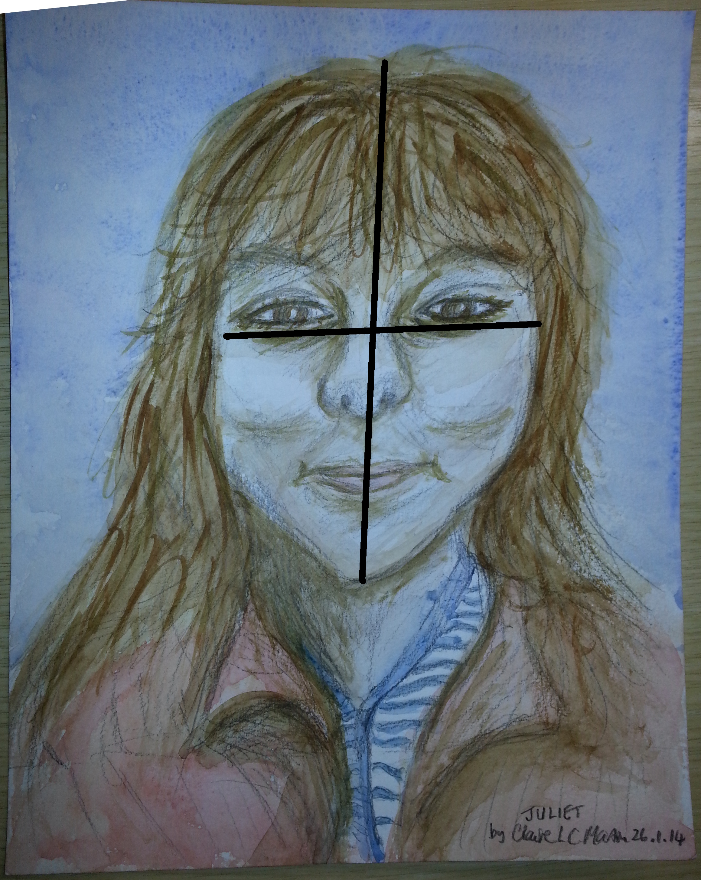
 Back to the eyes, then. Humans like to see faces that have horizontals and verticals. It is how we converse, face to face, and our brains do an awful lot of work in averaging out tiny movements. A consequence of this when we are painting is that we are in the habit of thinking features will be horizontal or vertical, even when they are not. I have added the vertical line to the picture here – the face is correctly pitched as in the original photo, but the eyes are drifting back towards strictly horizontal, because the artist is human, and expects them to be like that. Have a look at the mouth and see if you can spot the same. The nose is more tricky, because it comes further out from the face and so will be off centre if the head is turned, but have a look at that as well. Back to the eyes, then. Humans like to see faces that have horizontals and verticals. It is how we converse, face to face, and our brains do an awful lot of work in averaging out tiny movements. A consequence of this when we are painting is that we are in the habit of thinking features will be horizontal or vertical, even when they are not. I have added the vertical line to the picture here – the face is correctly pitched as in the original photo, but the eyes are drifting back towards strictly horizontal, because the artist is human, and expects them to be like that. Have a look at the mouth and see if you can spot the same. The nose is more tricky, because it comes further out from the face and so will be off centre if the head is turned, but have a look at that as well.
In addition to the horizontal/vertical problem, humans also concentrate too much on the central triangle of the face, where the eyes, nose and mouth are. Many pictures of faces end up with no forehead, because the central part has been stretched. The artist has avoided that here – she put the right things in the right places, which is surprisingly difficult. The proportions are good, which is why, despite the errors here, the portrait could be used to identify someone.
So, a lot of things to work on there. I would not try working on them all at once, however. There is so much to take in that I would consider all of these slowly. I could have made a full blog post out of any of these points. So, the order:
- Don’t use lines where you can use areas. Interlock the areas if you have to, do build up depth.
- Get the pitch of features right. This is the underlying part of portraiture – if you have this, other things get much easier.
- Get the tones right. How dark is something compared to the rest of the picture, and the rest of the feature? The hair is a good example here.
- Get the shape of features right. This is the really hard part. I use grids, photography, and a checklist of things to be sure I have this covered.
I am still working my way through chunks of this list, and I will be forever. Art should be a continual process of improvement, and a trend towards perfect that can never quite meet it.
|