Adding Colour Part 1
|
Other than finding out what interesting things my phone made of watersoluble when run through autocorrect, I made a bash at answering, but I am going to expand here, because this is one of those really big topics. So, I start with the questions, and then I will ask a few and make a few points of my own. This is a chatty post, but it should cover a lot. 1) OK. I admit it. Citadel Paints. Almost all of my experience with acrylics comes from painting models an inch high. When I first had to learn to paint on a canvas three feet tall, I drove my teacher insane. However, I could also add the highlights on a fold of cloth so that the shadows looked as if the person wearing it was very small and very far away. That is basically what 2D painting is. The Citadel range gave me a selection of paints where I could look at what went with what, and mix in gradients to go from pale to dark. That was invaluable. Would I recommend them for a serious artist? Well, no. They are made for a very particular purpose, and come in annoyingly tiny measures.
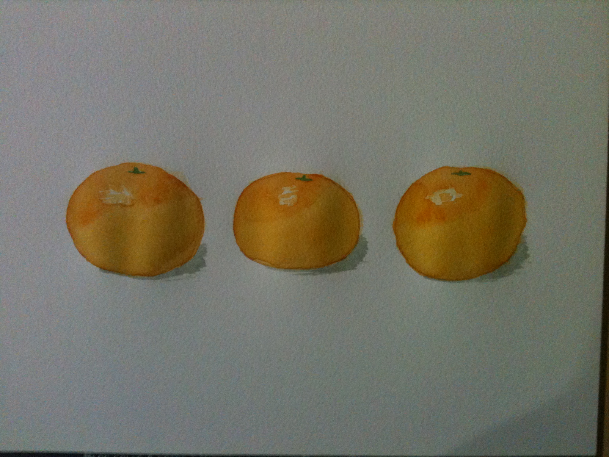
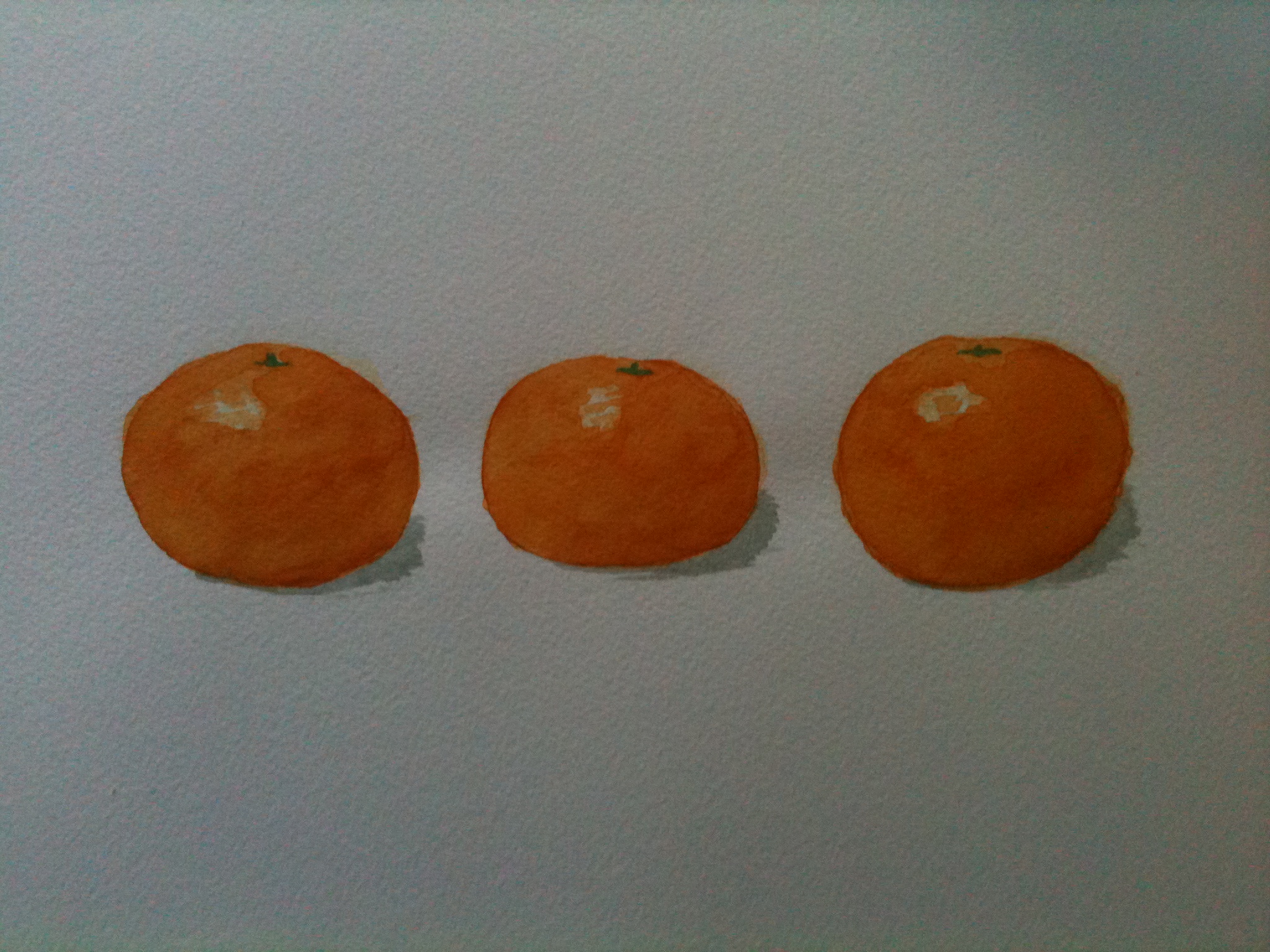
That said, oil paints are a chore. I work daily, and I can keep my paint brushes in a tub of white spirit in a room where I do not have to sleep or eat. I can also leave my easels up with wet paint all over them. Unless you have a dedicated area and you don’t mind having projects that take days, oil paints might not be worth the bother. Acrylics or watercolours are left to choose from, then, leaving aside things like oil bar (huh?) chalk (gets in the carpet) and pastel (gets in the carpet and your phone jacks). Both dry easily and quickly. Acrylic paint is a liquid that dries to a plastic. It is pretty tough, and you can paint it on most things. Broadly (and I am not an expert) it can be used two ways, as a mass colour, or as glazes. A mass colour is where there is so much paint that it becomes opaque. You cannot see through it at all, and so things like translucence are ignored, but things like shine may still count. Glazing is putting one colour over another so you can see a bit of both. Given the delicacy of the paint film with watercolours, glazing is harder although still possible with them.
Right. That is enough for part 1. Part 2, here we come. *Yes, I genuinely was. Sometimes I make things up, but only for a living. |