|
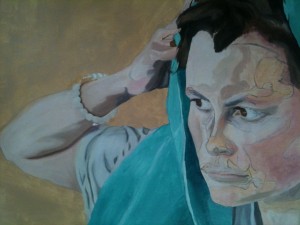
This day’s work was supposed to be a development of a pearl bracelet, and nothing more. Pearls are a strange material. They are a matrix of something that is basically limestone, and if you rub two pearls together they will feel ever so slightly gritty. They catch the light, so much that their material gives us the adjective ‘nacreous’ – lustrous like nacre, or mother of pearl. They block light, unlike diamonds, but like diamonds they organise it into funny patterns that hit the eye pleasingly. This is not a highly scientific term, but the wikipedia page on pearls is available for those who want to read it, and is very interesting. For the rest of us, which includes me even after having taken in what pearls are, they have an attribute that I like. They are pretty. They shine.
This is lovely in candle-light, but not so nice to paint. Pearls do not have a fully reflective surface. Like brushed steel, they soften light that falls on them. I needed several tries just to get the right shape, because I got hung up on the highlights that would not exist until the next stage. I realised something while I was painting this, about my photography habits. The first picture, below, is the first one I took. While things were going badly and the pearls were malformed, I did not feel I was making progress, so I did not take any progress photographs for the blog. That habit may prove useful if I notice that I am not photographing something.
 There are several interesting points here. One, which you can only see if you click on the painting and zoom right in, is that the pearls are greyish on this layer but already have different highlights. Each one is a slightly different colour. There is a metaphor in there if you want one, so feel free to make up your own. I am a painter, not a writer, and I prefer being compared to an onion; bitter, and not very complex. There are several interesting points here. One, which you can only see if you click on the painting and zoom right in, is that the pearls are greyish on this layer but already have different highlights. Each one is a slightly different colour. There is a metaphor in there if you want one, so feel free to make up your own. I am a painter, not a writer, and I prefer being compared to an onion; bitter, and not very complex.
So, moving right on, you can also see that the clasp of the bracelet has a half-formed pearl on it, which will get covered when I finish the background, and that I had to add in the shadows of the bracelet itself, and the flesh of the arm around it. Then I got carried away, and added in the rest of the arm. Then I thought ‘this is the same tone as I need for the face’ and suddenly I had finished a rather larger area than I thought I would, and done it by accident. I just had to keep on advancing the edge of the pain because it did not blend properly with the old colour, and then there was a new edge to blend. You can see the start of the process in the picture above.
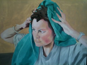
In the picture below, you can see the end result:
 Here, I ran into one of the weaknesses of my current method. I did not have a good print of the area I wanted to use, and the colour matching of squinting at the laptop followed by trying to paint was unworkable. As a result, this is too pale, particularly on the forehead, and the angles are a little too rounded, as everything has lost depth. However, I am generally pleased with it, because I can suddenly see how the picture is going to work and I did not have that overview until now. Here, I ran into one of the weaknesses of my current method. I did not have a good print of the area I wanted to use, and the colour matching of squinting at the laptop followed by trying to paint was unworkable. As a result, this is too pale, particularly on the forehead, and the angles are a little too rounded, as everything has lost depth. However, I am generally pleased with it, because I can suddenly see how the picture is going to work and I did not have that overview until now.
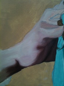
Highlights of the work for me include a single spot of colour on my lower lip that defines the edge of it, the hem of the T-shirt (unchanged since last time, but still working with the new stronger face) and the underside of the right hand:
 The colour might or might not be a little too pink – the iPhone camera is not a good enough image, and until the rest of the skin and the surroundings are correct, I will not know. This, like the T-shirt, might be at its finished state, but like the T-shirt, I suspect it will need one more layer once everything passes it in surface completion. One good reason to put more paint on it is to blend it into the complex shapes of the fingers above, which I have yet to complete. Blending into a transparency is possible, but trickier than blending into a wet colour. The colour might or might not be a little too pink – the iPhone camera is not a good enough image, and until the rest of the skin and the surroundings are correct, I will not know. This, like the T-shirt, might be at its finished state, but like the T-shirt, I suspect it will need one more layer once everything passes it in surface completion. One good reason to put more paint on it is to blend it into the complex shapes of the fingers above, which I have yet to complete. Blending into a transparency is possible, but trickier than blending into a wet colour.
From the wrist shadow downwards, it needs more subtlety, but the visible part of the forearm from bracelet to elbow has good tone on it, and may also be finished. That depends in great part on the background being completed.

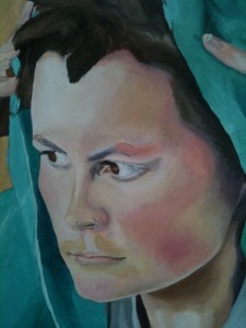
And here is the face in close-up. The iPhone makes it look too yellow, and there are a few errors, but on the whole I think it is a good middle layer, and I will look forward to painting over this with a good print of the whole as my guide.
|